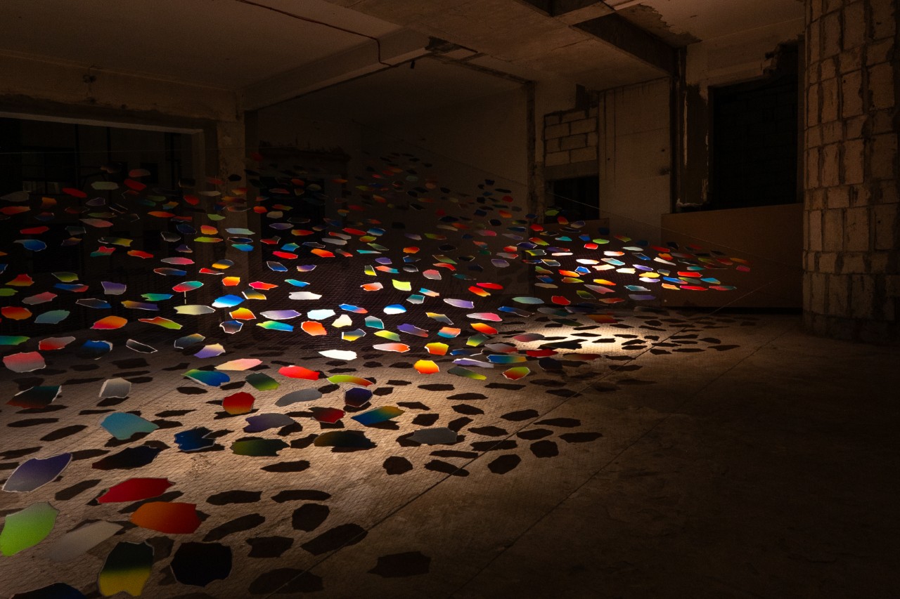
Imagine walking through a structure that still bears the physical scars of history—weathered concrete, rusted rebar, and the silence of decades past—only to be met by a sudden, weightless explosion of color. Can a simple gradient of light-reflecting paper truly heal a space? This is the central question posed by the Japanese design studio SPREAD at the second edition of We Design Beirut 2025. Their installation, 'Much Peace, Love and Joy,' isn't just an art piece; it’s a profound exploration of how vibrant color gradients and hand-torn letterpress paper can bridge the gap between memory, emotion, and the architecture of a city in revival.
We Design Beirut: A City-Wide Celebration of Resilience
Before we dive into the sensory details of the installation, it is essential to understand the stage upon which it was set. We Design Beirut 2025 marked the second edition of a festival that has become a beacon of cultural continuity. Commemorating nearly 50 years since the start of the Lebanese Civil War, the event was themed around "Legacy, Revival, and Continuity."
Founded by Mariana Wehbe, the festival transformed the city into a living gallery. Across five key historical locations, eight major exhibitions were presented, each inviting visitors to reconsider the relationship between Beirut’s past and its creative future. For an interior editor like myself, who often looks at how spaces dictate our moods, seeing an entire city engage in this "urban therapy" was nothing short of breathtaking.
"Design is not just about the objects we place in a room; it is about the legacy we leave in the spaces we inhabit." — Mariana Wehbe
'Much Peace, Love and Joy': The Core Concept
At the heart of this city-wide dialogue was SPREAD’s headline installation. SPREAD’s installation at We Design Beirut 2025, titled 'Much Peace, Love and Joy,' uses vibrant color gradients and hand-torn letterpress paper to explore the intersection of emotion, memory, and spatial design.
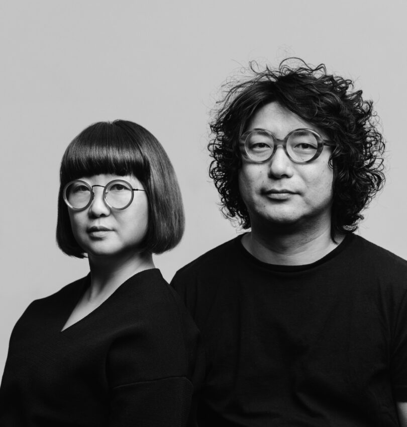
The designers behind the project, Haruna Yamada and Hirokazu Kobayashi, are known for their ability to weave together the technical and the emotional. Their philosophy centers on the idea that color is a universal language—one that can bypass intellectual barriers and speak directly to the human spirit. In Beirut, a city that has seen its fair share of darkness, SPREAD sought to inject a "quiet joy" into the urban fabric.
The Craftsmanship: Letterpress and Hand-Torn Landscapes
To achieve this, SPREAD utilized a unique, highly specialized letterpress technique. While letterpress is traditionally used for flat, solid colors, Yamada and Kobayashi developed a method to print intricate gradients that mimic the transition of light in nature—from the soft pink of dawn to the deep indigo of twilight.
The process didn't stop at the press. Each piece of paper was hand-torn, creating irregular, organic edges that symbolize the fragments of memory and the imperfection of human experience. These fragments were then meticulously assembled into:
- Floating Net Configurations: Large-scale, three-dimensional structures that hung from ceilings, swaying gently with the air currents.
- Framed Landscapes: Smaller, intimate works that allowed viewers to focus on the tactile texture of the paper and the depth of the ink.
- Organic Spatial Forms: Installations that appeared to "grow" out of the architectural ruins, blurring the line between the built environment and the art.
A Tale of Two Venues: Contrast and Dialogue
One of the most compelling aspects of 'Much Peace, Love and Joy' was its dual-venue approach. By placing the same artistic concept in two vastly different environments, SPREAD demonstrated how design adapts to and transforms its context.
1. Villa Audi Mosaic Museum: The Harmony of History
In the pristine environment of the Villa Audi, the installation acted as a contemporary echo of the ancient Roman mosaics housed there. The vibrant gradients of the paper mirrored the colored stones of the mosaics, creating a bridge across millennia. Here, the design felt like a celebration—a sophisticated nod to the enduring power of craftsmanship.
2. Immeuble de l’Union: The Light in the Dark
The contrast could not have been sharper at the Immeuble de l’Union. This 1952 modernist landmark, though once a symbol of Beirut’s golden age, currently stands as a weathered shell of its former self. Against the dark, ruined concrete walls and the skeletal remains of the building, SPREAD’s "Journey of Light" became a symbol of hope.
| Feature | Villa Audi Mosaic Museum | Immeuble de l’Union |
|---|---|---|
| Architectural Style | Neoclassical / Historic | Modernist (1952) |
| Atmosphere | Pristine, Curated, Ancient | Raw, Ruined, Industrial |
| Design Dialogue | Harmony with ancient Roman mosaics | Transformation of dark, scarred concrete |
| Viewer Impact | Appreciative, Reflective | Emotional, Transformative, Hopeful |
The Power of Color in Public Spaces
As an editor, I often advocate for the use of color in residential design to improve mental well-being, but seeing it applied at this scale in a public, historical context was a reminder of design's civic duty. SPREAD intentionally left the interpretation of their work open. They didn't provide a manual on how to feel; instead, they created a space where "quiet joy" could emerge naturally.
This approach is particularly relevant for those of us looking to bring a sense of peace into our own homes. SPREAD’s work teaches us that:
- Texture Matters: The hand-torn edges remind us that perfection is not a prerequisite for beauty.
- Color is Fluid: Gradients are more soothing than solid blocks of color because they mimic the natural world.
- Context is Everything: A bright piece of art in a "dark" or neglected corner can completely redefine the energy of a room.
"We wanted to create a moment where the past and the present don't just coexist, but actually converse through the medium of color." — SPREAD
Conclusion: The Future of Beirut’s Creative Ecosystem
'Much Peace, Love and Joy' was a highlight of We Design Beirut 2025, but its impact extends beyond the dates of the festival. It served as a proof of concept for Mariana Wehbe’s vision: that design can be a tool for reconciliation and revival. By reclaiming ruined spaces like the Immeuble de l’Union and filling them with contemporary light and color, the event proved that Beirut’s creative ecosystem is not just surviving—it is thriving.
As we look toward the future of interior design and urban planning, SPREAD’s work reminds us that the most successful designs are those that acknowledge the scars of the past while providing a vibrant, joyful path forward.
Key Facts: We Design Beirut 2025
- Dates: October 22-26, 2025
- Total Venues: 5 key historical locations across the city
- Featured Installations: 8 major exhibitions, including SPREAD’s 'Much Peace, Love and Joy'
- Theme: Legacy, Revival, and Continuity
- Founders: Mariana Wehbe, in collaboration with Samer Alameen and Bananeh Jamil
FAQ
Q: What is the significance of the paper used in SPREAD's installation?
A: SPREAD used high-quality paper printed with a unique letterpress gradient technique. The paper was hand-torn to create organic, irregular forms, symbolizing the beauty in imperfection and the fragments of memory that make up our lives.
Q: Why was the Immeuble de l’Union chosen as a venue?
A: The Immeuble de l’Union is a landmark of Beirut's 1952 modernist architecture. Its current state—a mix of historic grandeur and war-torn ruin—provided the perfect "dark" canvas to highlight the transformative, joy-bringing power of SPREAD's vibrant color installations.
Q: Can these design principles be applied to home interiors?
A: Absolutely. Ivy Chen suggests that using color gradients, tactile textures, and intentional "pops" of brightness in darker spaces can replicate the emotional lift provided by SPREAD's large-scale installations on a more personal, residential level.