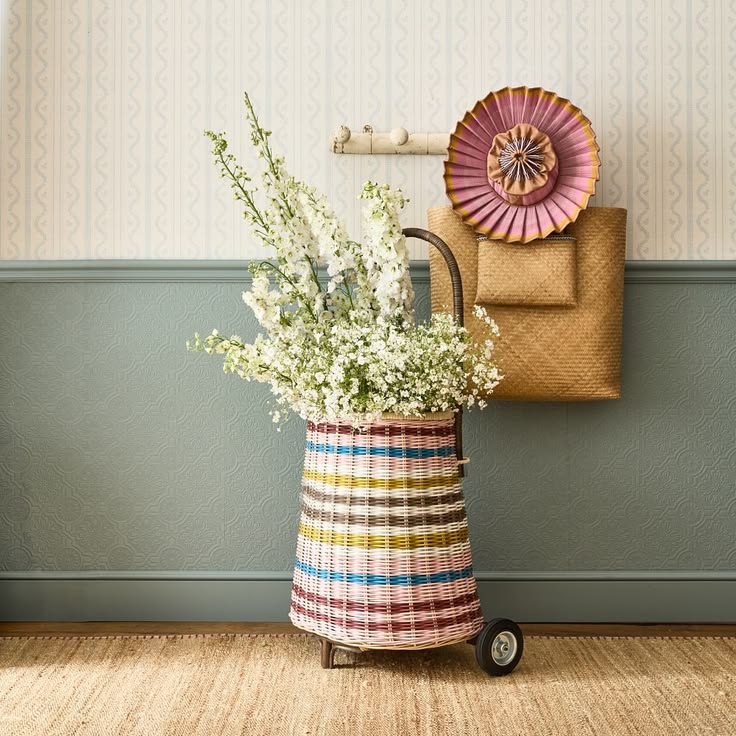
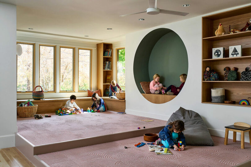
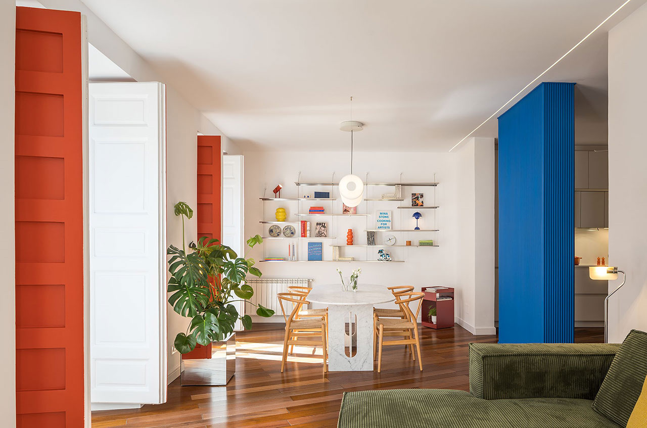
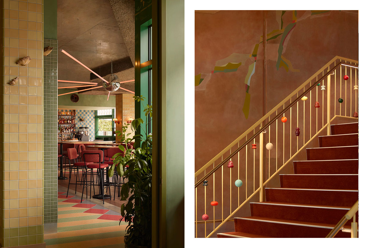
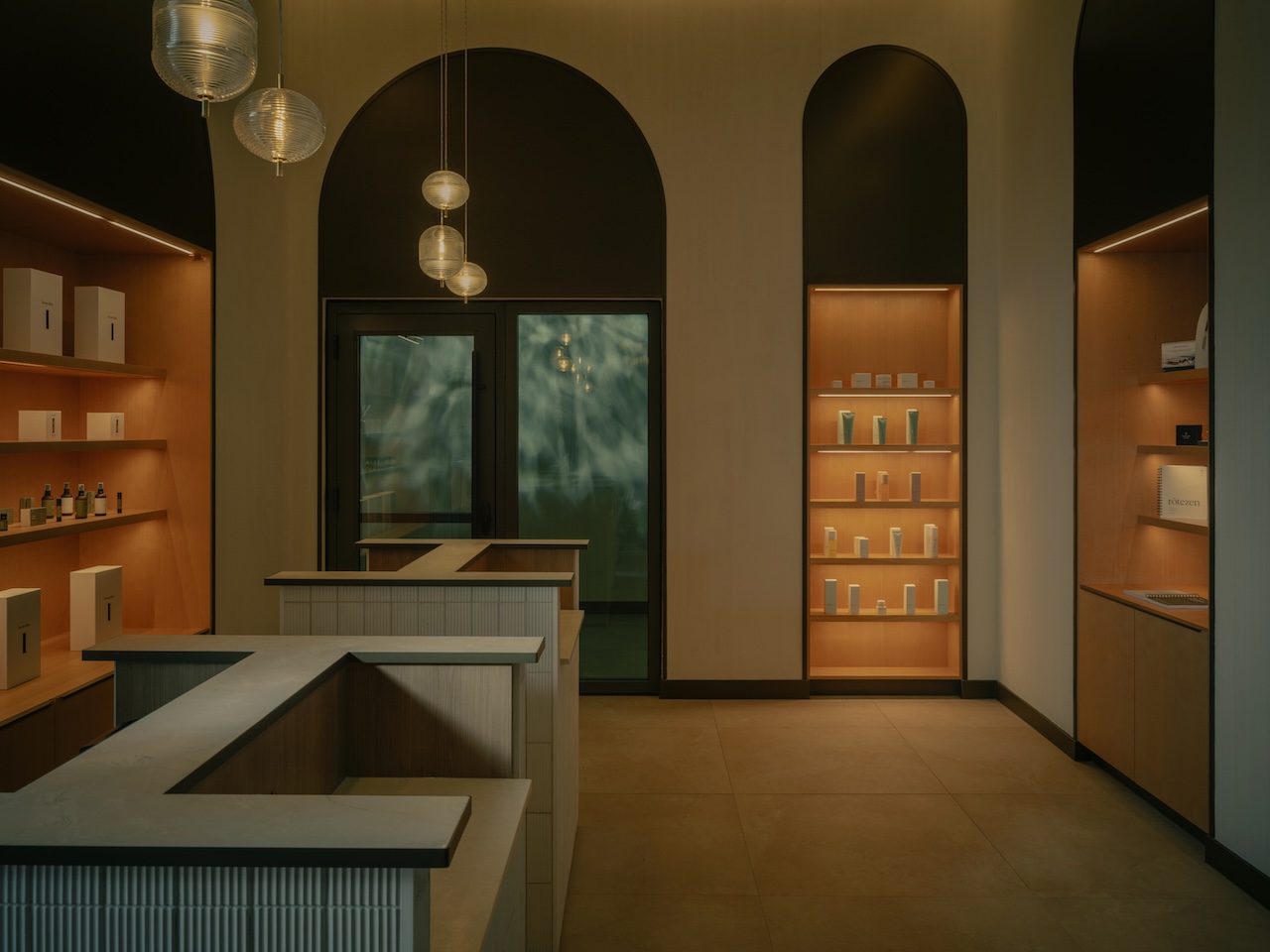
Home should feel like a sanctuary—a soft place to land when the world outside feels increasingly loud. As an editor, I’ve spent years watching color trends ebb and flow, but the most profound shift I’ve witnessed recently is a collective yearning for interiors that provide a "warm hug." We are moving away from the clinical, sharp-edged minimalism of the past decade and leaning into spaces that feel lived-in, breathable, and deeply restorative.
Current interior forecasts for 2026 confirm this visceral shift: 82% of designers are actively moving away from the cool, sterile grays that dominated the 2010s in favor of warm "greiges" and wellness-focused neutrals. This isn't just a matter of taste; it’s a response to our need for domestic tranquility. Market data reflects a 35% year-over-year increase in consumer searches for "biophilic paint palettes"—colors that bridge the gap between our four walls and the natural world. In this landscape, Farrow & Ball remains the gold standard for achieving that elusive, chalky depth that transforms a room from a mere space into a mood.
The Ultimate Serene Pairing: Skimming Stone and Slipper Satin
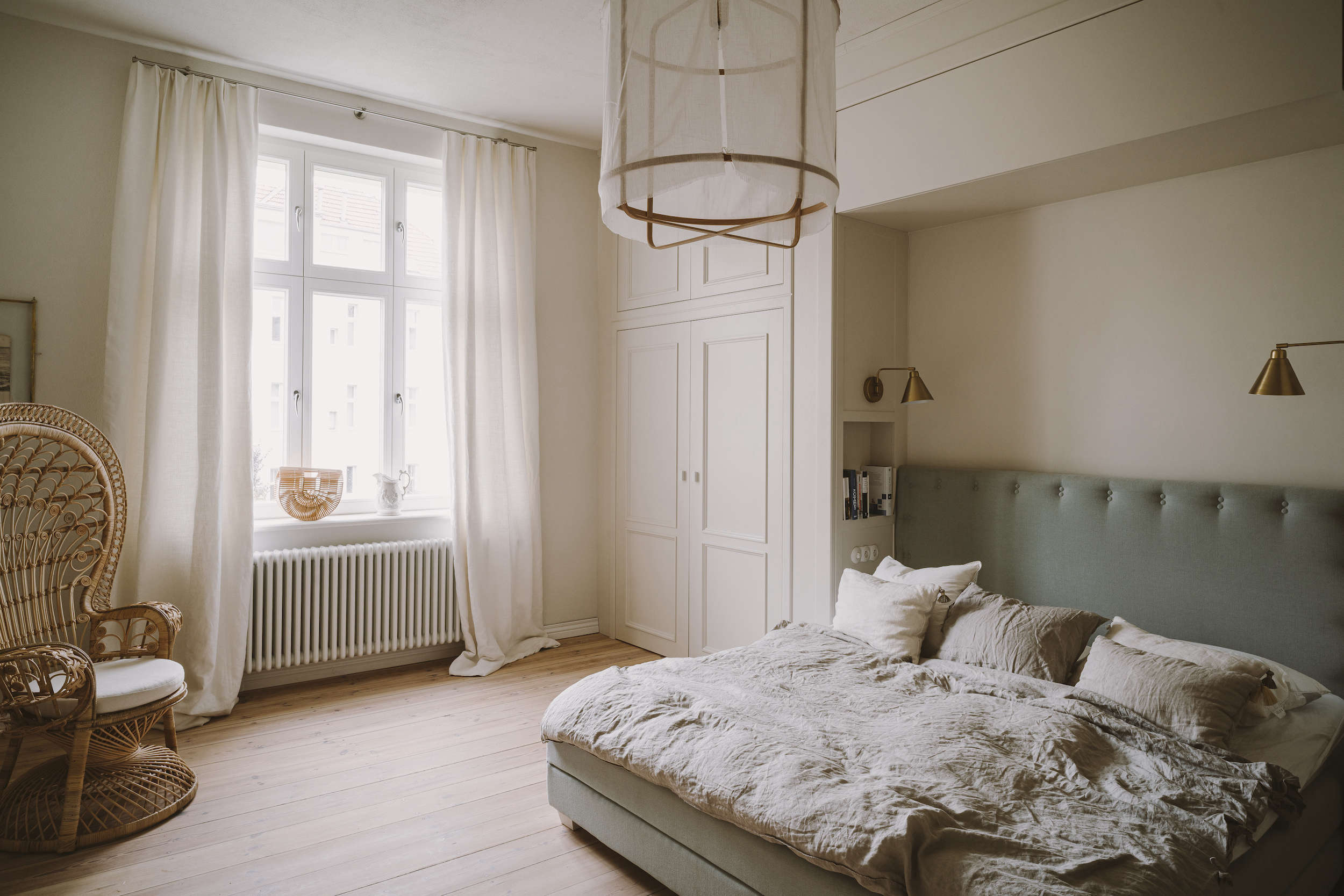
If you are searching for the definitive palette for a calm, nearly colorless bedroom, look no further than the pairing of Skimming Stone #241 and Slipper Satin #2004. This combination is the interior design equivalent of a cashmere blanket.
Skimming Stone is a sophisticated, stony off-white with a warm, heavy pigment that prevents it from ever feeling cold. When paired with Slipper Satin—a creamy, versatile white without any jarring yellow undertones—the result is what I call the "Baltic Coast" aesthetic. It mimics the soft, diffused light of a cloudy day by the sea, where the boundaries between the walls and the ceiling seem to dissolve.

To execute this pairing effectively, I recommend using Skimming Stone on the walls and Slipper Satin on the woodwork and ceiling. This creates a subtle "white-on-white" effect that has enough contrast to look intentional but enough harmony to feel effortless.

Designer Tip: To truly elevate this palette, focus on the "tactile layers." Because the color palette is so restrained, your textures must do the heavy lifting. Layer your bed with heavy-weight natural linens and introduce a vintage wicker chair or a jute rug to ground the ethereal wall colors.
2026 Trend Spotlight: Nature-Leaning Greens and Meditative Blues
As we look toward 2026, the palette for calm interiors is expanding to include "Nostalgic Naturals"—shades that evoke the sky, the forest floor, and the mist.
For spaces that struggle with limited natural light, such as north-facing bedrooms or small studies, Pale Powder #204 is my top recommendation. This soft aqua-blue has a unique ability to mimic the airy feel of the sky. In a dimly lit room, it doesn't turn "muddy"; instead, it glows with a quiet, meditative energy.
If your goal is to create a more "grounding" environment, we are seeing a massive resurgence in earthy, biophilic greens. Sap Green or the more muted Mistle are perfect examples of "Nature’s Neutrals." These colors foster a deep psychological connection to the outdoors, effectively lowering the heart rate the moment you walk through the door.
| Color Name | Vibe | Best For |
|---|---|---|
| Pale Powder #204 | Airy & Meditative | Small rooms with limited light |
| Mistle | Grounded & Heritage | Kitchen cabinetry or garden rooms |
| Pigeon #25 | Sophisticated & Moody | Mudrooms and cozy dens |
| Sap Green | Vibrant & Organic | Feature walls in sun-drenched spaces |
Desert-Inspired Hues: The 'Sunbaked' Glow
Beyond the greens and blues, there is a growing movement toward desert-inspired hues like Setting Plaster #231 and Faded Terracotta. These shades offer a different kind of calm—one that feels warm, sun-drenched, and incredibly flattering to all skin tones.
Setting Plaster, named after the color of newly plastered walls, is a dusty pink that feels sophisticated rather than "girly." It works beautifully in hallways and dining rooms, creating a soft, welcoming glow that feels like a permanent sunset.
Pro Tip: If you find a color like Setting Plaster slightly too saturated for your space, ask your paint specialist to mix it at 75% intensity. This retains the beautiful pigment profile but softens the "punch," making it even more conducive to a serene environment.
Technical Mastery: Choosing the Right Finish and Light
A beautiful Farrow & Ball color can look vastly different depending on the finish you choose and the light it receives. Understanding these technicalities is what separates a DIY project from a professional interior.
The Impact of Light Direction
- North-Facing Rooms: The light here is cool and bluish. Avoid cool grays, which will look flat. Instead, use warm-based neutrals like Dimity or Joa’s White to bring in much-needed "internal sunshine."
- South-Facing Rooms: These rooms are flooded with warm light. You can afford to use cooler tones like Pale Powder or Skimming Stone, as the natural warmth of the sun will balance out the pigments.
The Finish Guide
Farrow & Ball is famous for its high pigment load and low-sheen finishes, which provide that signature "velvet" look.
- Estate Emulsion (2% sheen): The classic Farrow & Ball look. It is very chalky and matte, perfect for low-traffic areas like bedrooms and living rooms where you want the deepest color payoff.
- Modern Emulsion (7% sheen): A bit more durable and washable. This is the "Wellness Choice" for kitchens and bathrooms where moisture and high traffic are factors.

Professional Application: The 'Go Big' Method
To ensure your chosen palette delivers the calm you’re after, never rely on a tiny swatch. I always advise my readers to "Go Big."
- Large Format Swatches: Paint a large piece of A3 cardstock with two coats of your chosen color. Move it around the room at different times of the day—morning light, afternoon sun, and under your evening lamps.
- The Primer Secret: Farrow & Ball colors are water-based and rich in pigment. Using the recommended F&B primer (e.g., White & Light Tones, Mid Tones, or Dark Tones) is not a marketing gimmick; it ensures the topcoat adheres correctly and the color depth is true to the tin.
- Two Coats Minimum: Because of the high pigment, a second coat isn't just for coverage—it’s where the "soul" of the color truly comes alive.
FAQ
Q: Can I use Skimming Stone in a kitchen? A: Absolutely. However, for cabinetry or high-traffic walls, I recommend using the Modern Emulsion or Modern Eggshell finish. It provides the same beautiful stony hue but allows you to wipe away spills without damaging the paint.
Q: Is "Pale Powder" too blue for a neutral lover? A: Pale Powder is a "chameleon" color. In some lights, it looks like a soft gray; in others, a delicate aqua. If you want a neutral space with just a hint of "atmosphere," it is much more interesting than a standard beige.
Q: Why are designers shifting toward "warm hugs" like Dimity? A: Dimity is a pale, warm taupe. After years of the "cool gray" era, which can often feel sterile, Dimity provides a sense of wellness and comfort. It’s an easy way to make a modern, minimalist home feel soulful and inviting.
Creating a calm home isn't about following every trend—it's about selecting a palette that resonates with your personal sense of peace. Whether you choose the ethereal pairing of Skimming Stone and Slipper Satin or the grounding depth of Mistle, remember that paint is simply the backdrop for your life. Choose colors that let you breathe.