The words “Parisian studio apartment” might conjure up a glamorously disheveled space—think overflowing bookshelves, a vintage velvet chair tucked into a dusty corner, and the charming chaos of a rooftop garret. But in the reality of 2026 urban living, that bohemian disarray often translates to "cramped." As we move toward a more intentional way of inhabiting our cities, the rooftop aesthetic is being upended by a new wave of striking, high-performance retreats.
Living generously in a 350-square-foot footprint isn't just about finding a place for your keys; it’s about a fundamental shift in how we perceive volume and flow. To maximize a 350-square-foot studio, architects now recommend pushing all built-in elements to the perimeter of the apartment. This "Perimeter Strategy" frees up the central living area for better circulation, effectively turning a cramped box into a versatile gallery. When we approach design with this level of surgical precision, the "small apartment" label fades away, replaced by a sense of curated luxury.
1. The Perimeter Strategy: Maximizing the Floorplate
The most common mistake in small-space design is treating a studio like a shrunken version of a three-bedroom house. We try to float sofas in the middle of the room or place bulky wardrobes where they "fit," inadvertently chopping up the precious floor area. In the 2026 design landscape, we embrace the Margin Rule.
By moving storage cabinets, kitchen units, and even sleeping nooks to the extreme margins of the floorplan, small apartments can gain up to 30% more usable floor area compared to traditional furniture layouts. This isn't just a theory; it’s a spatial revolution popularized by firms like Corpus Studio. Their approach involves cabinetry that literally "tucks" into corners, creating a seamless, architectural envelope that hugs the walls.
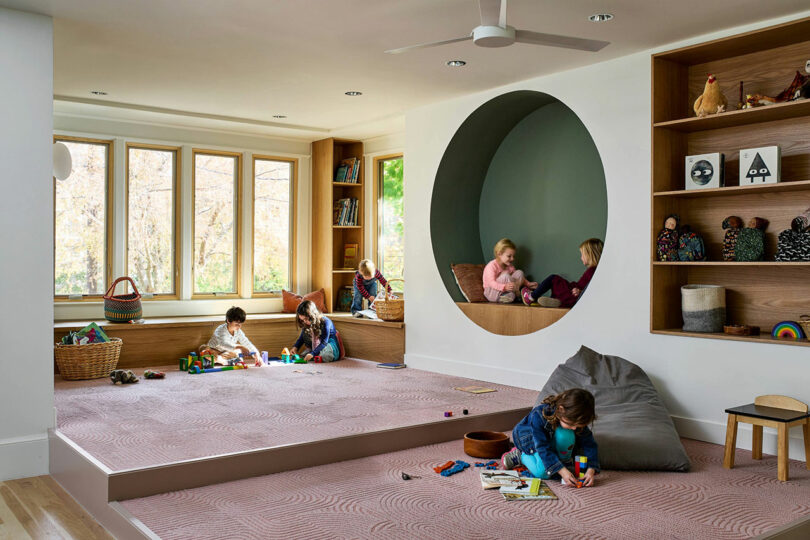
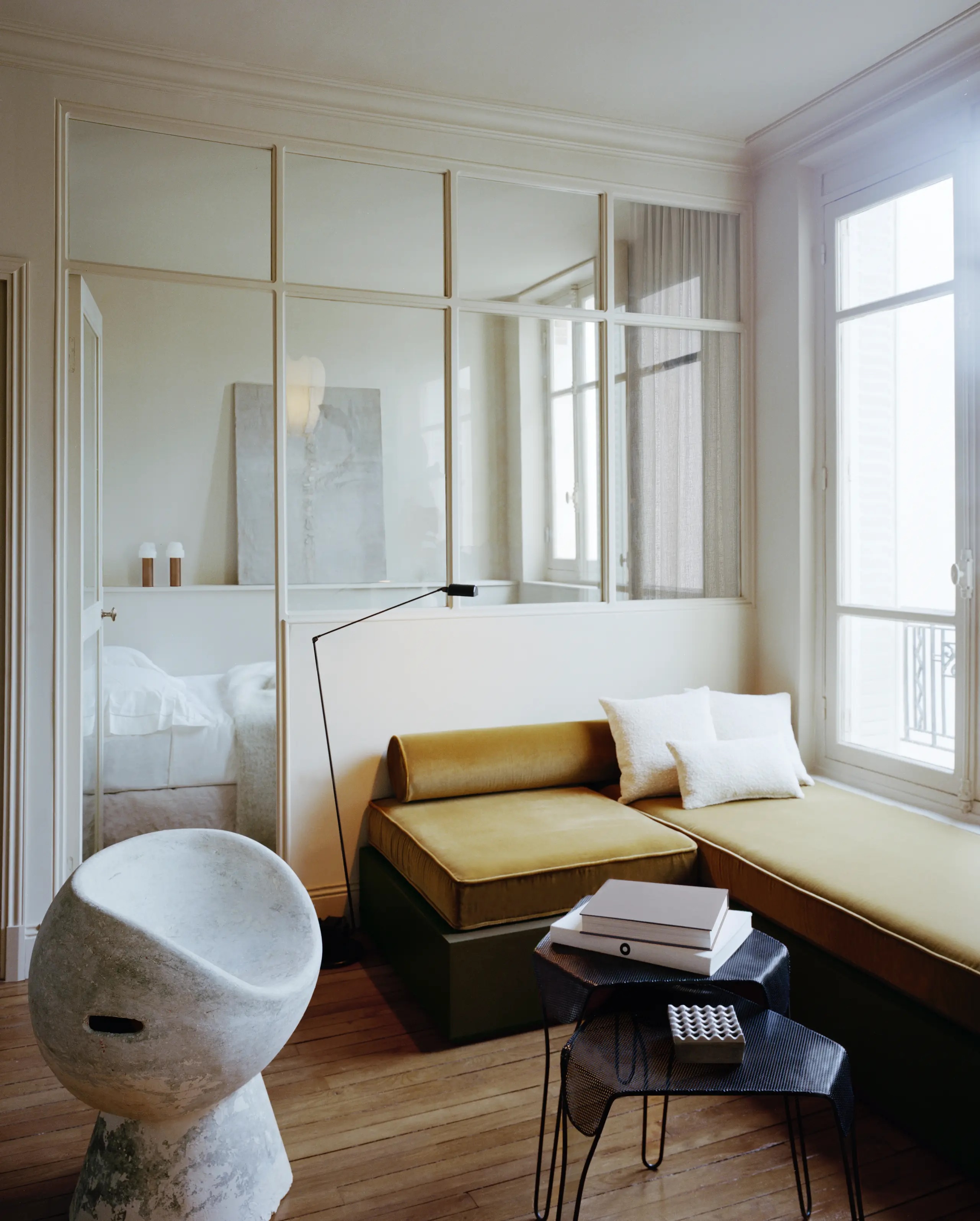
Imagine a single wall that houses your wardrobe, your media center, and your kitchen pantry, all finished in the same muted tone. This visual continuity prevents the eye from "stuttering" as it moves across the room. We often suggest bespoke benches tucked beneath windows; they offer a place to lounge and store winter linens without encroaching on the central "stage" of the apartment.
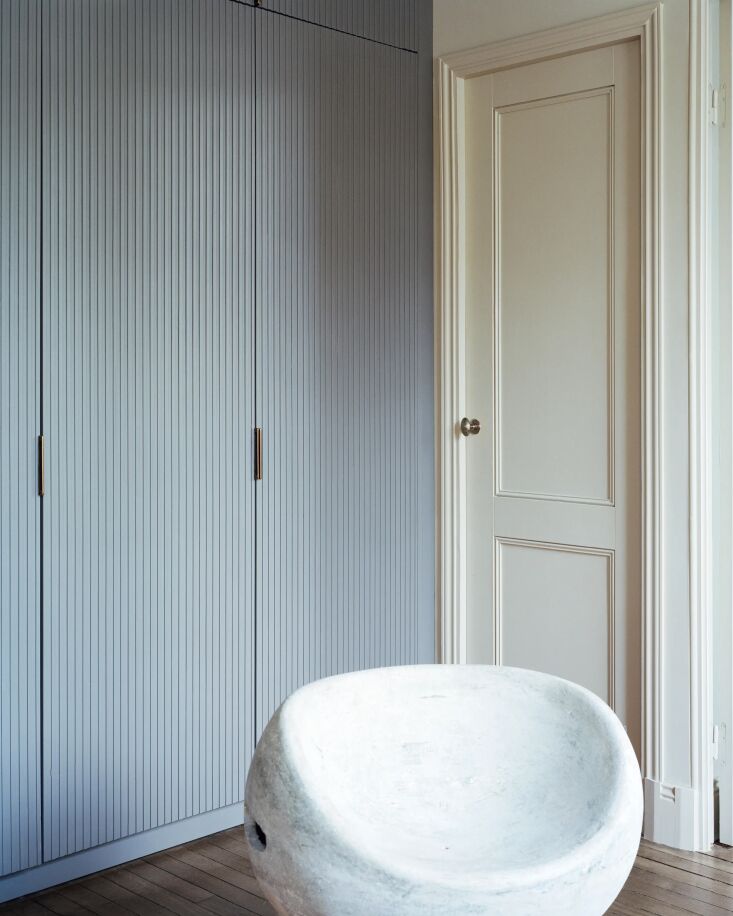
The 2026 Pro Tip: When designing perimeter storage, use "touch-to-open" hardware. Eliminating handles flattens the visual plane, making the cabinetry feel like a sophisticated wall treatment rather than a series of boxes.
2. Strategic Zoning: Walls Are Out, Flow Is In
One of the hardest habits to break is the urge to build walls to "create" rooms. In a 350-square-foot studio, a single drywall partition can feel like a claustrophobic barrier. Instead, we advocate for zoning through atmospheric cues. Zoning in a studio apartment is best achieved by using rugs, lighting, or glass partitions rather than solid walls. This maintains the visual flow and ensures that natural light—the most valuable currency in Paris—reaches every corner.
The Path Test
Before you buy a single piece of furniture, you must perform the Path Test. This is a design technique used to map your daily movement—from the entry to the kitchen, or from the bed to the bathroom. Take a piece of painter's tape and mark your primary walking routes on the floor. If a furniture layout forces you to "zig-zag" or shimmy past a table edge, it’s failing the test. Your movement should be a straight, unobstructed line.
Visual Partitions
If you must have a physical separation—perhaps to shield the sleeping area from the kitchen—look toward the "Atelier" style. Utilizing wood-framed glass partitions instead of solid drywall increases ambient light distribution in compact units by an average of 40%. It provides the psychological comfort of a separate bedroom without sacrificing the "loft" feel.
| Feature | Traditional Layout | Perimeter Strategy |
|---|---|---|
| Furniture Placement | Floated/Central | Pushed to Margins |
| Circulation | Interrupted/Zig-zag | Clear/Open Center |
| Storage | Standing Wardrobes | Integrated Built-ins |
| Light Flow | Blocked by partitions | Maximize via Glass/Openness |
| Usable Floor Area | Baseline | +30% Increase |
3. 2026 Space-Saving Furniture Essentials
In 2026, furniture is no longer "static." It must earn its keep by performing multiple roles. We are seeing a move away from the clunky sofa-beds of the past toward the "Murphy Cabin." These are sophisticated wall-bed systems that integrate shelving, hidden desks, and even ambient LED lighting. When the bed is up, you have a sleek home office; when it's down, a sanctuary.
Convertible Dining is another non-negotiable. The traditional four-leg dining table is a space-killer. We recommend console tables that expand to seat four, or drop-leaf designs on high-quality casters. The ability to wheel your dining surface to the side when the meal is over is the ultimate small-space flex.
Hidden Storage Ottomans remain a staple, but with a 2026 twist: look for modular cubes that can be "ganged" together to form a coffee table or separated to act as extra seating for guests. This prevents what we call "explosion clutter"—the phenomenon where everyday items migrate to every flat surface because they don't have a designated home.
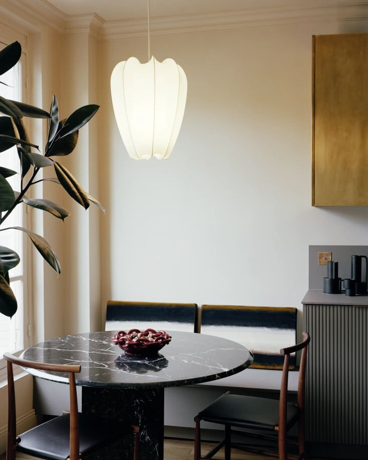
4. Visual Expansion: The 'Double Space' Illusion
Design is as much about psychology as it is about floorplans. To make a 350-square-foot studio feel like a 700-square-foot apartment, we employ the "Double Space" illusion.
- The Mirror Opposite: This is an old trick that never fails. Place a large-scale, floor-to-ceiling mirror directly opposite your primary window. It reflects the Parisian streetscape and doubles the amount of natural light entering the room. It effectively creates a "second window."
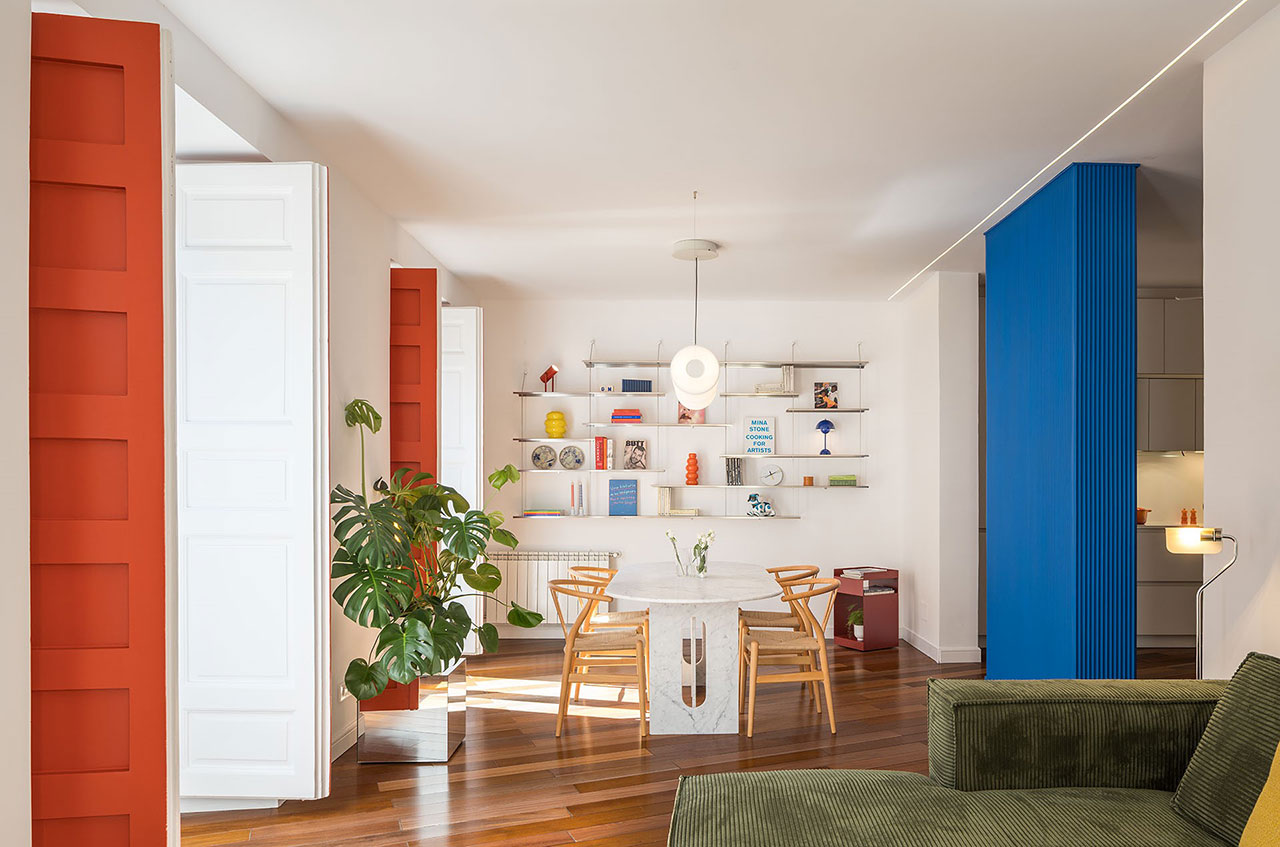
- Monochrome Palettes: Using a unified color story—such as 'Ecorce Grise' (a warm, bark-like grey) or creamy neutrals—connects disconnected zones. When the floor, walls, and even the large furniture pieces share a similar tonal value, the boundaries of the room disappear.
- Verticality: Always look up. Utilizing floor-to-ceiling shelving and hanging curtains several inches above the actual window frame draws the eye upward. This emphasizes the ceiling height, making the footprint feel secondary to the volume of the room.
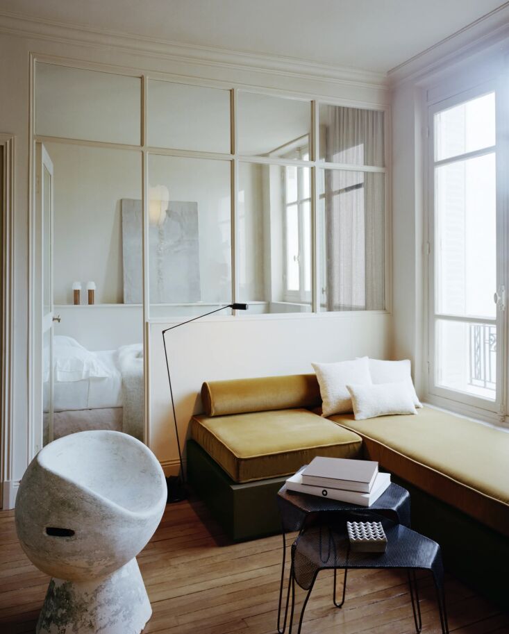
5. The High-Low Mix: Custom Looks on a Budget
The most successful Parisian makeovers aren't necessarily the most expensive; they are the most clever. We often utilize the Nicolas Payet Method: a "High-Low" strategy that involves using standard IKEA cabinet frames for the interiors (the "Low") and pairing them with custom brass or solid oak fronts (the "High"). This gives you the functionality of a mass-market system with the soul of a bespoke commission.
Texture is your best friend in a small space. Because you have fewer items, the items you do have must be exceptional. We love mixing flea market finds from Saint Ouen—perhaps a 1950s French floor lamp or a weathered oak stool—with 20th-century design icons. This blend of history and modernism is what gives a Parisian studio its unmistakable character.
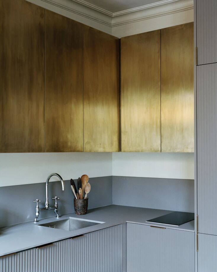
Don't be afraid of a "hero" piece. A single, large-scale piece of art or a sculptural light fixture can actually make a room feel larger by providing a singular focal point, rather than a dozen small "fussy" decorations that clutter the visual field.
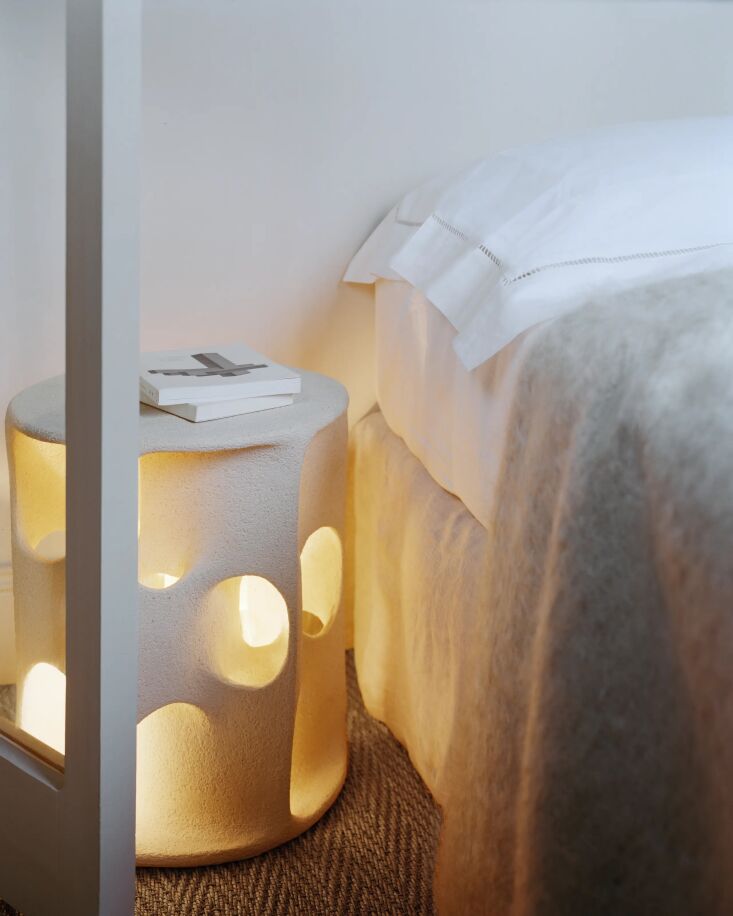
The 2026 Pro Tip: Avoid "micro-furniture." Tiny rugs and tiny chairs actually make a room look smaller. Use a large rug that tucks under the edges of your furniture to ground the space and make the floorplate feel expansive.
FAQ
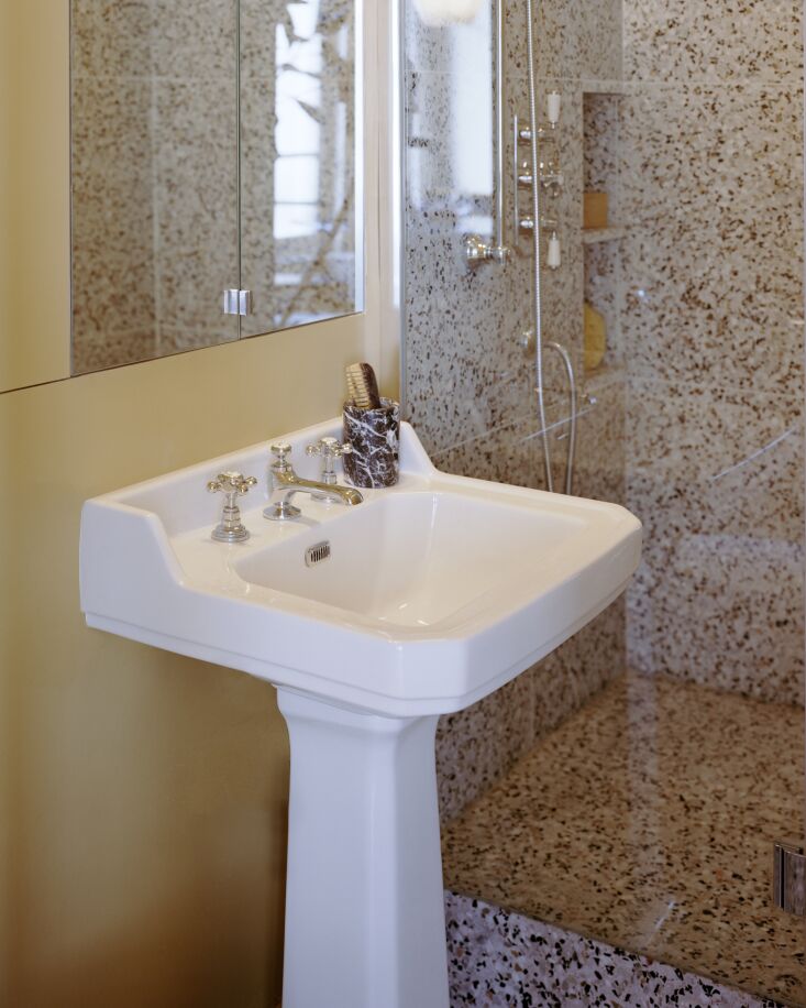
How do I handle a tiny bathroom without it feeling like a closet? Don't be afraid of bold choices. In a small bathroom, we often recommend leaning into the "jewel box" effect. Use vibrant colors or floor-to-ceiling tiles to create a sense of intentionality. A bold yellow or deep forest green can make a tiny footprint feel vibrant rather than cramped.
What is the best way to hide a "work from home" setup in a studio? The "Cloffice" (Closet-Office) is a classic for a reason. If you have an alcove or a section of your perimeter cabinetry, install a pull-out desk surface. The key to the 2026 makeover is the ability to "close the door" on work at 6 PM, mentally separating your living space from your professional life.
Is it possible to have a "real" kitchen in 350 square feet? Absolutely. The secret is integrated appliances. A panel-ready dishwasher and a compact, two-burner induction cooktop allow the kitchen to blend seamlessly into your perimeter cabinetry. When the appliances are hidden, the kitchen looks like a beautiful piece of furniture.
Ready to transform your own small space? Whether you are in a Parisian garret or a New York studio, the principles remain the same: simplify the layout, maximize the margins, and never settle for furniture that only does one job.