There is a specific kind of architectural friction that occurs when European modernist sensibilities meet the rigid, boxy symmetry of 1980s American suburbia. For a design-savvy couple in Washington D.C.—one of whom was raised in Italy surrounded by clean lines and functionalist forms—the standard-issue "center-hall Colonial" was less of a dream home and more of a spatial puzzle waiting to be solved.
The transformation, led by the visionary team at Fowlkes Studio, is a masterclass in what I call "Modernist Sophisticate." It isn’t about stripping the soul out of a traditional house; it’s about refining its geometry. To modernize a 1980s brick Colonial, the strategy must be twofold: streamline the exterior by purging decorative "noise"—think shutters and multi-pane windows—and gut the interior’s cellular layout. By replacing rigid partitions with custom millwork that stops short of the ceiling, you allow natural light to bleed through the entire floor plan, creating an organic flow that the original builders never imagined.
In this guide, we’ll dissect how this D.C. renovation reclaimed underutilized space—including 15% of a redundant garage—and used architectural anchors to turn a fragmented house into a cohesive, monolithic retreat.
Exterior Overhaul: Streamlining the Suburban Facade
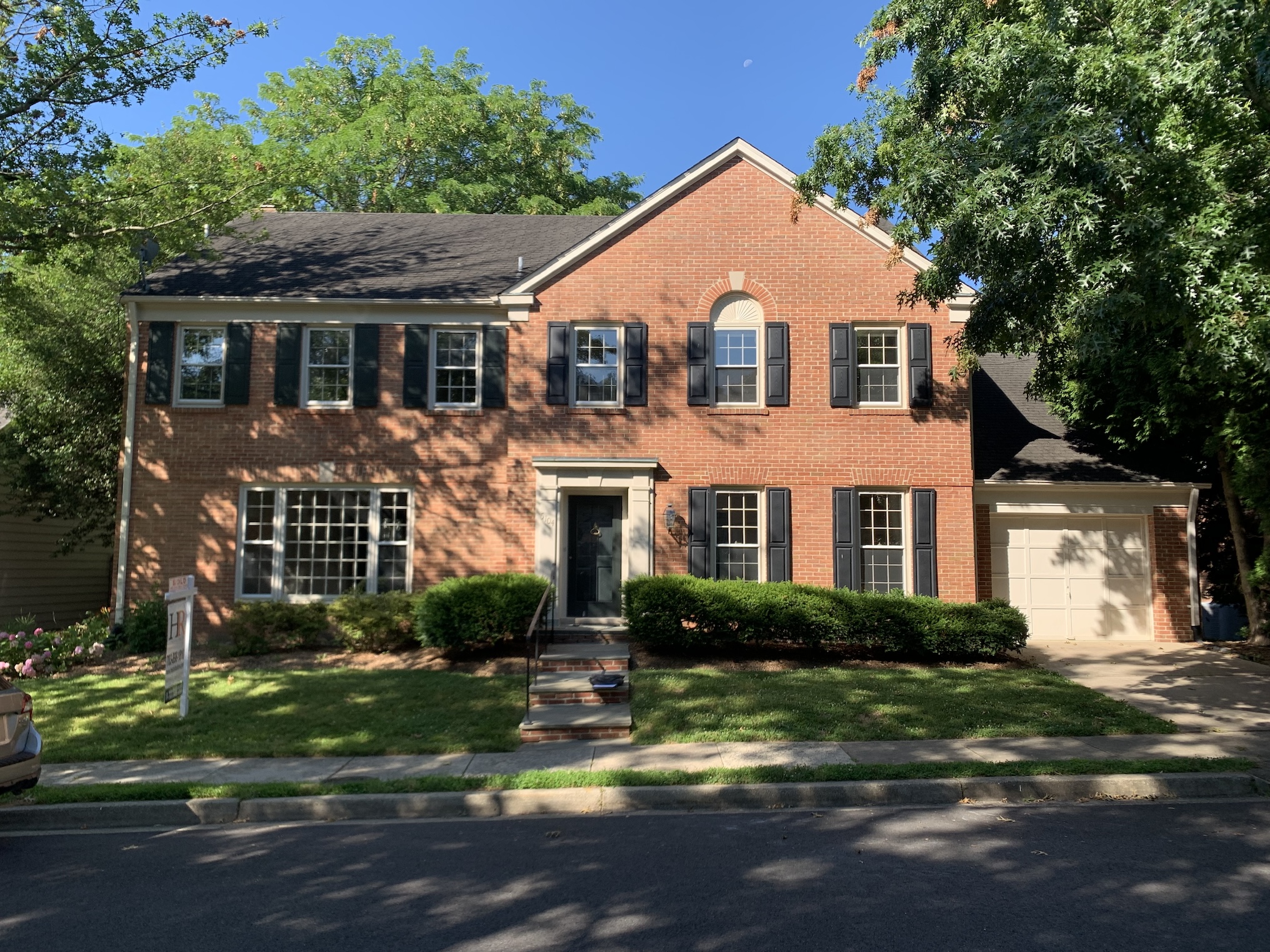
The 1980s was a decade of "more is more" in suburban architecture, but not the good kind. We saw an abundance of faux-traditional details: plastic shutters that didn't shut, red brick that felt heavy, and divided-lite windows that sliced up the view. The first step in this modernist makeover was a visual edit.
We began by stripping the "buttoned-up" elements. Out went the shutters; in came the light. The original red brick was given a sophisticated, moody update using Farrow & Ball’s ‘Blackened’ at a 50% tint. This specific formula provides a soft, atmospheric grey that shifts with the light, moving the house away from "suburban traditional" and toward "contemporary monolith."
Technical Spec: The Exterior Palette
Element Material/Selection Note Primary Masonry Painted Brick Farrow & Ball 'Blackened' (50% Tint) Windows Sleek Casement Frames Black aluminum for thin profiles Accent Railing Custom Steel Painted in a bold, Dutch-inspired orange Lighting Poul Henningsen Sconce Copper finish for warmth against grey
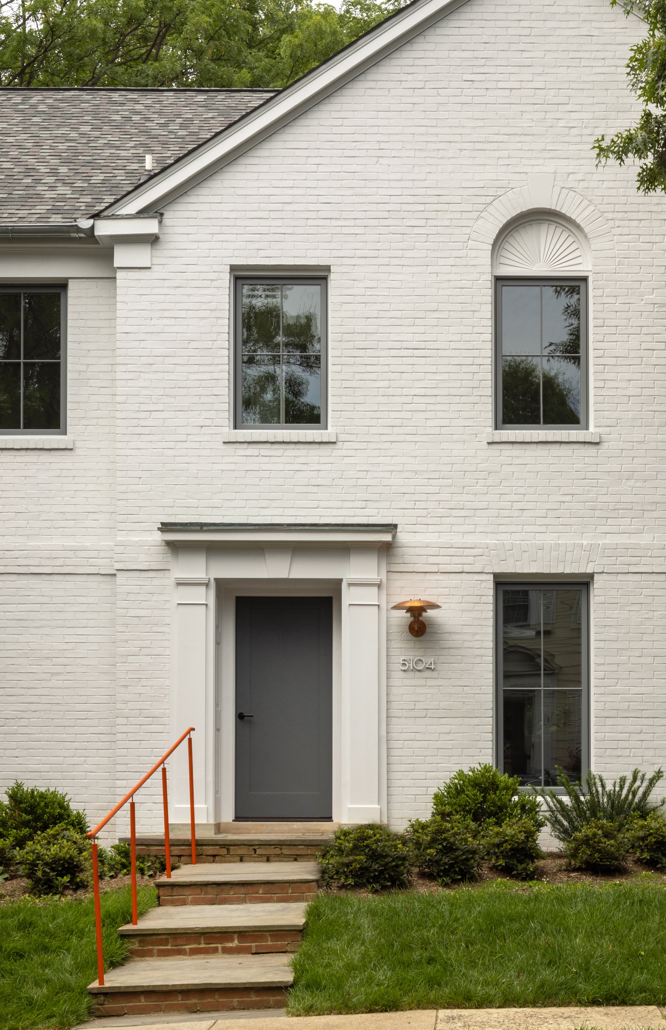
The result is a facade that feels intentional. By replacing the traditional windows with large, sleek casement frames, the house finally breathes. To prevent the dark exterior from feeling cold, Fowlkes Studio integrated warm accents: a Poul Henningsen copper sconce and a custom steel handrail in a striking orange-red, nodding to the owners' modernist roots.
Reimagining the Floor Plan: Breaking the Center-Hall Mold
The traditional center-hall Colonial is a series of isolated boxes. You have the "formal" living room, the "formal" dining room, and a kitchen tucked away at the back. It is a layout designed for a lifestyle that no longer exists.
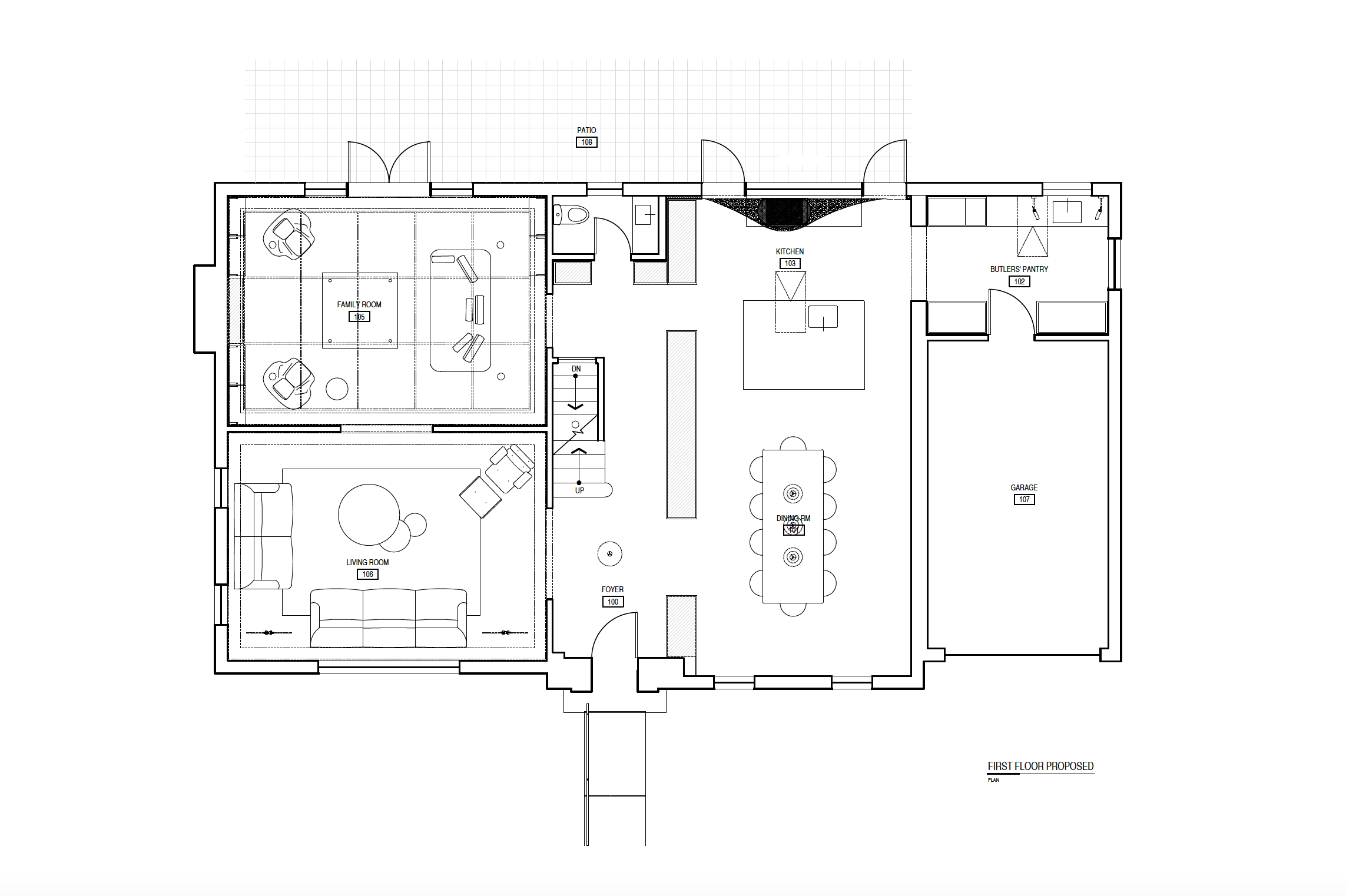
The challenge was to create an open-concept feel without losing the sense of "place" for each room. The solution? Custom millwork partitions. Instead of floor-to-ceiling drywall, Fowlkes Studio utilized wire-brushed white oak cabinetry to define spaces.
The ‘Two-Foot Rule’ One of the most brilliant moves in this renovation is the decision to stop all interior cabinetry and partitions approximately two feet short of the ceiling. This allows the ceiling plane to remain uninterrupted across the entire ground floor. The psychological effect is immediate: the house feels twice as large because your eye can track the light bleeding from the front windows all the way to the back.
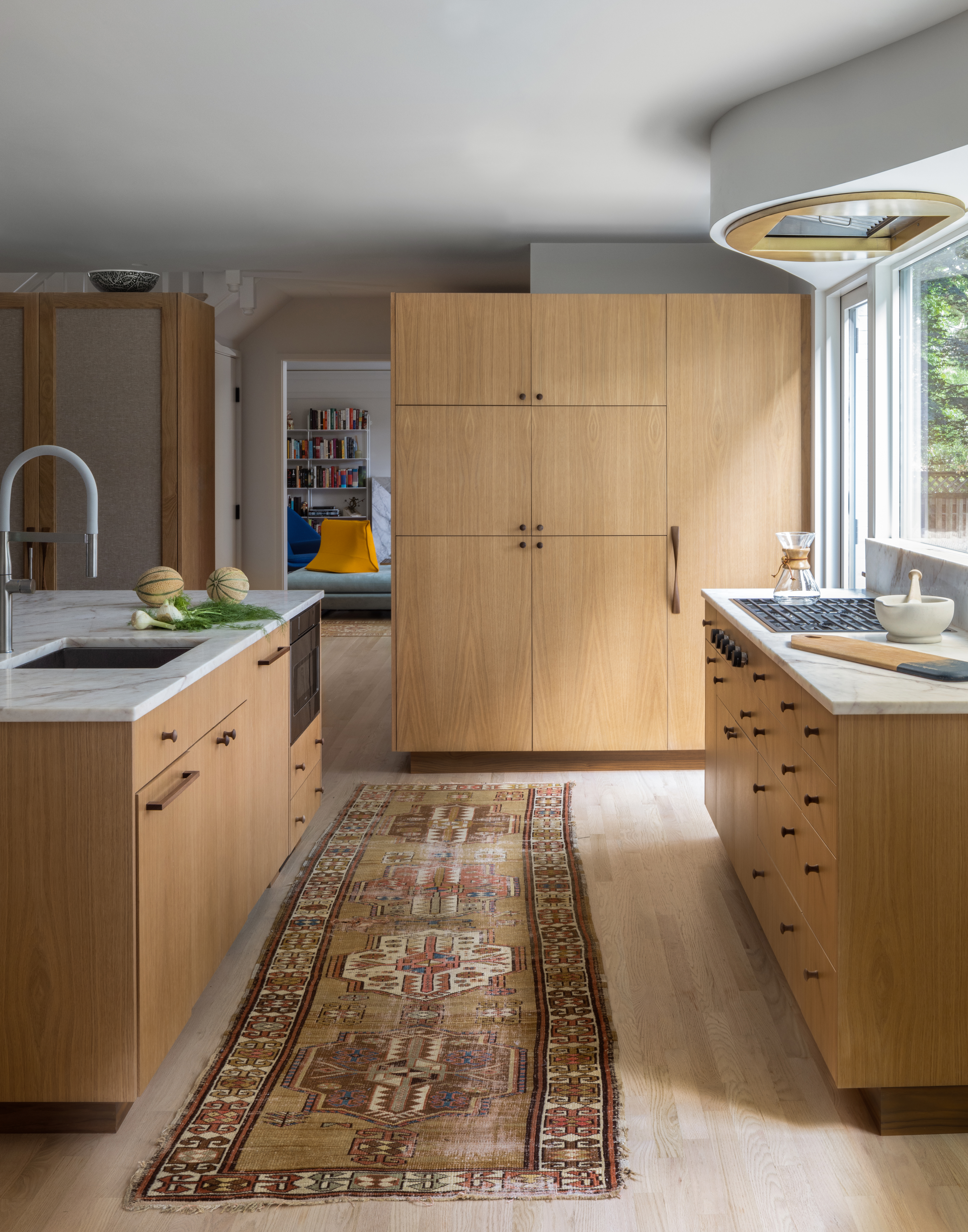
This approach doesn't just look better; it works harder. These partitions act as "thick walls," housing everything from hidden coat closets to media units, effectively turning the architecture itself into furniture.
The Kitchen and the Hidden Butler’s Pantry
In a modernist Colonial home makeover, the kitchen should be the centerpiece, but it shouldn't look like a cluttered workshop. To achieve this, Fowlkes Studio made a strategic trade: they reclaimed approximately 15% of the underutilized garage space to create a "hidden" butler’s pantry and secondary kitchen zone.
By moving the heavy lifting—the refrigerator, the secondary prep sink, and the bulk of the storage—into this hidden zone, the main kitchen was freed from the tyranny of upper cabinets.
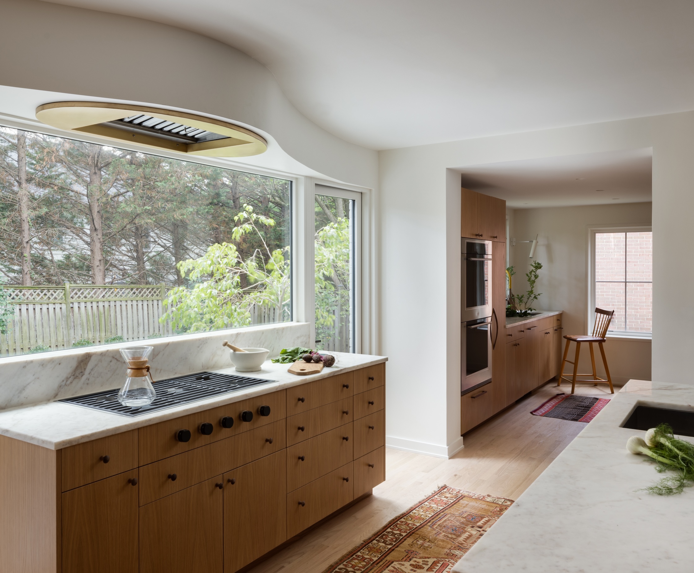
In place of cabinets, a massive, monolithic picture window was installed. It frames the backyard like a piece of living art. The material palette here is restrained yet tactile: wire-brushed white oak, Saffron White marble countertops, and a minimalist island that feels more like a sculpture than a workstation.
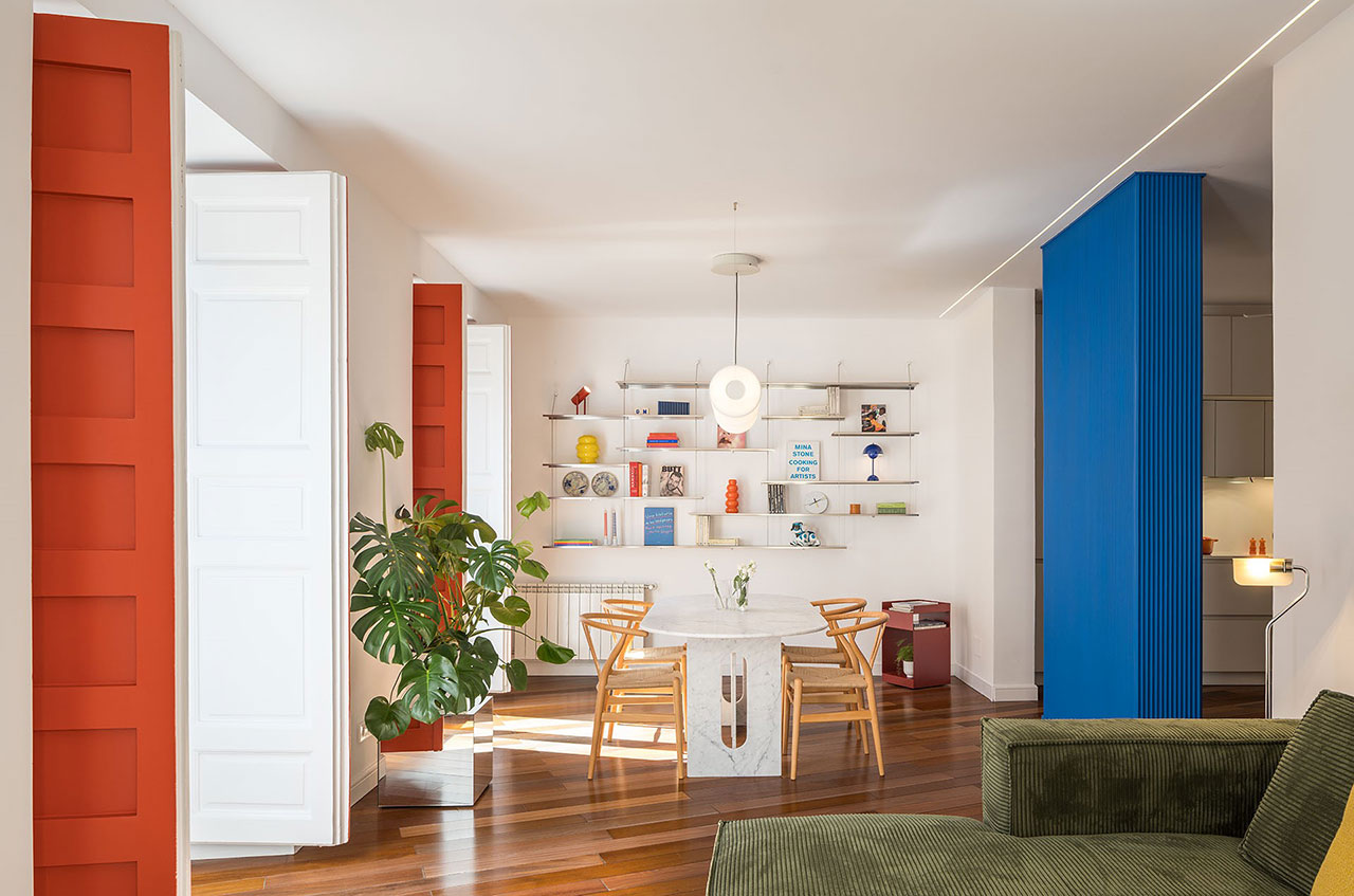
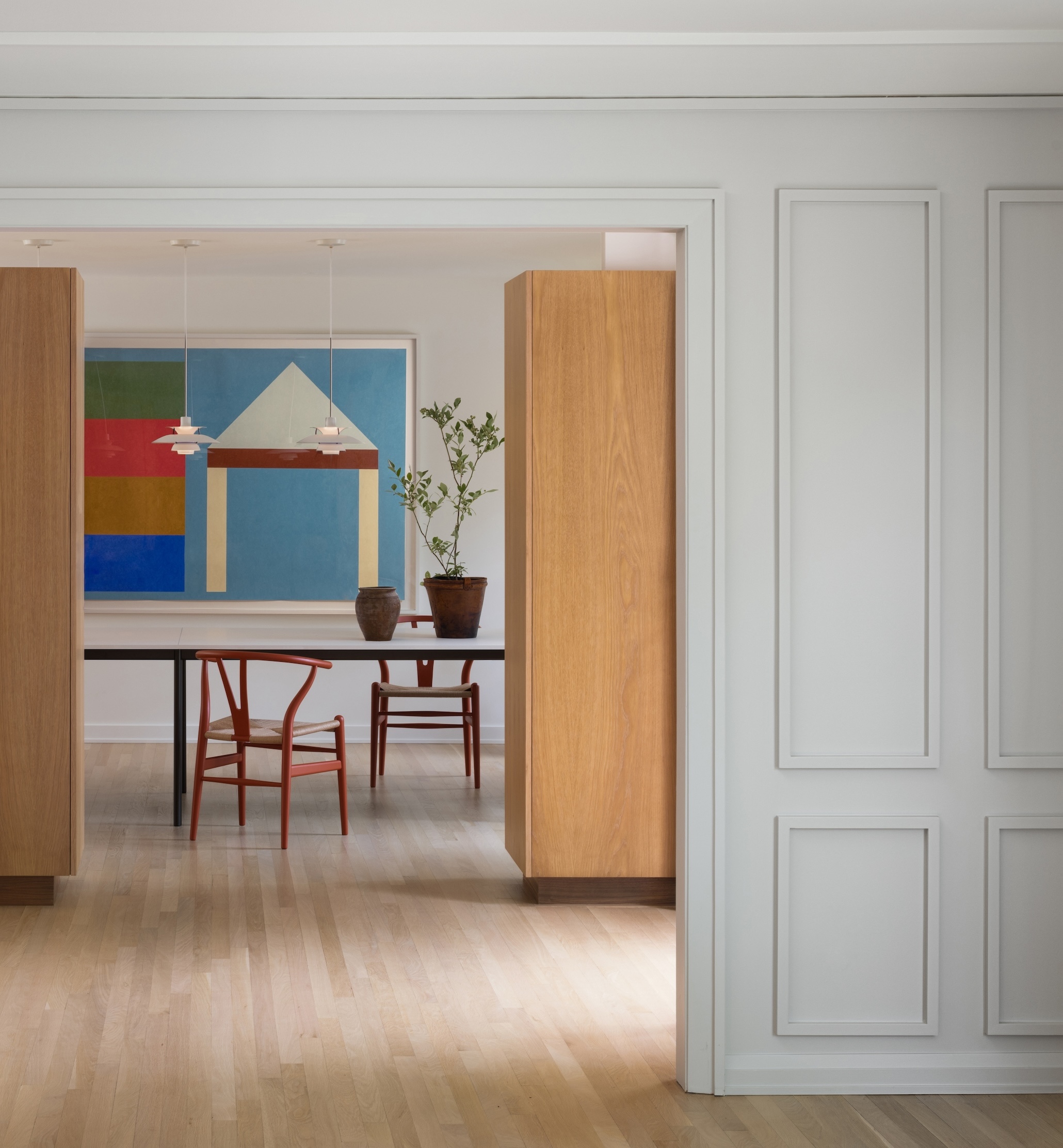
The dining area flows directly from this kitchen zone. To maintain the modernist edge, the owners opted for iconic tomato-red Wishbone chairs, providing a sharp contrast to the muted oak and white plaster walls.
The Primary Suite: Architectural Unity
The upper floor of a 1980s Colonial is typically a rabbit warren of small bedrooms and cramped bathrooms. Modernizing this requires a "slash and burn" approach to the existing floor plan. Fowlkes Studio combined two existing bedrooms and a dated bathroom into a singular, cohesive primary suite.
The design is organized around a central architectural anchor: a custom oak bed wall. This isn't just a headboard; it’s a functional divider that separates the sleeping area from the dressing room and bath without the need for traditional doors.
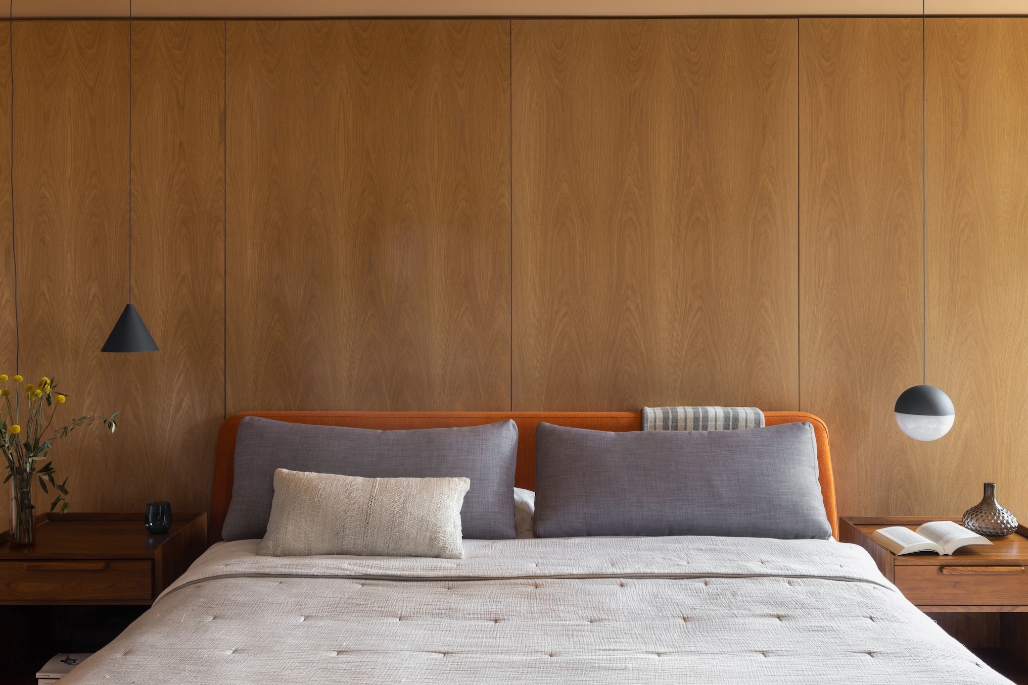
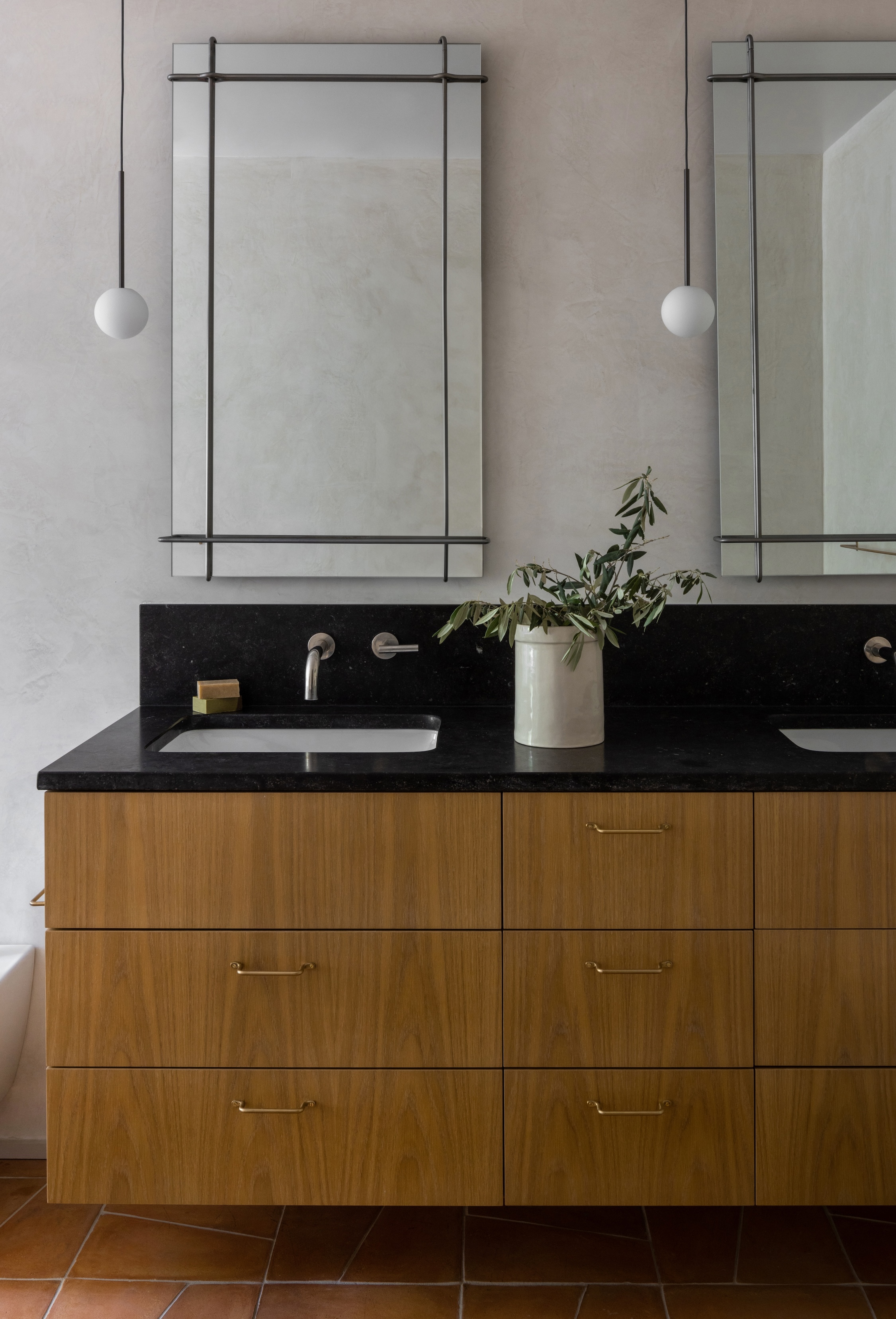
The materials in the suite shift toward the tactile and the luxurious. We see Venetian plaster walls that catch the light with a soft sheen, paired with Cotto tiles and Petite Blue limestone in the wet areas. The transition between the bedroom and the bath is seamless, creating a spa-like atmosphere that feels miles away from the home's suburban origins.
Functional Gains: Storage and Efficiency Stats
While the aesthetic shift is dramatic, the functional improvements are what make this renovation a long-term success. By replacing the 1980s-era "closet-in-every-room" approach with integrated, full-height millwork, the project increased accessible storage capacity by a staggering 35%.
Every square inch was interrogated. The garage reclamation not only provided the pantry but also allowed for a more efficient mudroom entry. Furthermore, by replacing the original drafty windows with high-performance casement units and adding sustainable insulation layers during the exterior repainting process, the home’s thermal efficiency was significantly modernized.
Interior Design Cheat Sheet: Materials to Watch
- Flooring: Wide-plank white oak with a matte clear coat.
- Wall Finish: Hand-applied Venetian plaster for a monolithic look.
- Hardware: Satin-finished blackened steel or bronze.
- Stone: Saffron White marble for kitchens; Petite Blue limestone for baths.
FAQ
Q: Can I paint any 1980s brick, or does it require special preparation? A: You can, but it is a "forever" decision. To achieve the Modernist Sophisticate look seen here, use a mineral-based paint or a high-quality masonry coating like those from Farrow & Ball or Romabio. These allow the brick to breathe, preventing moisture buildup.
Q: How do you handle the loss of privacy with an open-plan millwork partition? A: The "Two-Foot Rule" (stopping cabinetry short of the ceiling) provides visual connectivity but maintains acoustic and physical separation. By carefully placing these partitions, you can block direct sightlines into private areas while still allowing light to flow over the top.
Q: Is it worth sacrificing garage space for a pantry? A: In most 1980s Colonials, the garage is oversized for modern cars but poorly utilized for storage. Reclaiming even 10-15% of that footprint for a high-functioning "back kitchen" or butler's pantry significantly increases the daily livability of the main kitchen.
Final Thoughts
Renovating a 1980s Colonial is an exercise in subtraction. It is about removing the layers of suburban artifice to reveal a clean, functional volume. By focusing on the "Two-Foot Rule," a sophisticated paint palette, and a "monolithic" approach to cabinetry, you can transform a dated structure into a Modernist Sophisticate that rivals any new build.
If you’re ready to start your own transformation, focus on the flow. Forget the walls; think about the light.