Quick Facts
- Corner Threshold: Best for spaces under 36 inches deep to maintain circulation.
- Art Proportions: On narrow walls, art should occupy 50–75% of the horizontal span.
- Styling Height: Keep dresser-top decor under 12 inches to prevent a top-heavy look.
- Light Strategy: Use glossy Zellige tiles or reflective surfaces to bounce light into dark alcoves.
- 2026 Trend: Color drenching (painting walls, trim, and ceilings one color) to hide awkward angles.
- Market Insight: Storage-focused solutions are projected to reach 28.3% of the global small space furniture market by 2025.
- Core Principle: Successful awkward space decor blends functional aesthetics with spatial flow using verticality for depth and tonal contrast.
Approximately 46% of homeowners struggle with unusual room layouts when trying to style their interiors. Mastering awkward space decor requires understanding micro-zones and dimensional thresholds. To style awkward corners effectively, prioritize pieces that respect spatial flow, such as angled corner desks, L-shaped floating shelves, or slim plant stands. For areas under 36 inches deep, utilize verticality with floor-to-ceiling shelving or color drenching to unify sloping ceilings and irregular angles into a cohesive micro-zone.
The Psychology of the Gap: Why Corners Feel Awkward
When we walk into a room, our brains naturally look for symmetry and architectural anchors. When a room features an odd alcove, a sliver of wall between two doors, or a sharp corner that seems to serve no purpose, it creates visual friction. We often refer to these as dead spaces, but as a designer, I see them as missed opportunities for micro-zones.
The common mistake is trying to fill every void with furniture. This usually leads to a cluttered look that disrupts the spatial flow of the home. According to research, nearly half of all residents feel frustrated by these gaps, often because they try to treat an awkward corner like a main living area. Instead, the secret lies in respecting negative space. Negative space isn't empty space; it is the breathing room that allows your primary furniture to shine.
When you encounter an awkward gap, ask yourself: Does this need an object, or does it need a treatment? Sometimes, a high-contrast paint color or a change in texture is more effective than a chair no one will ever sit in. Understanding visual weight is the first step toward transforming these zones from planning failures into intentional design moments.
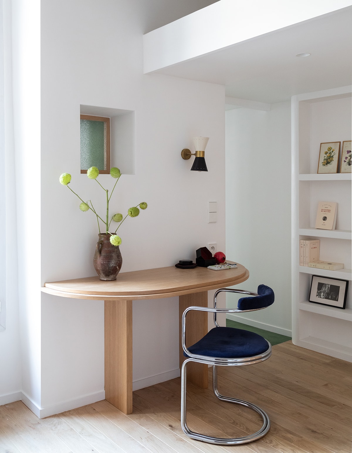
Solving Small Corner Decorating Ideas (<36" Deep)
Corners that are less than 36 inches deep are the most challenging because they are too small for standard armchairs but too large to leave completely bare. To master these areas, you must shift your perspective from horizontal to vertical. Utilizing verticality allows you to draw the eye upward, making the ceiling feel higher and the footprint feel less cramped.
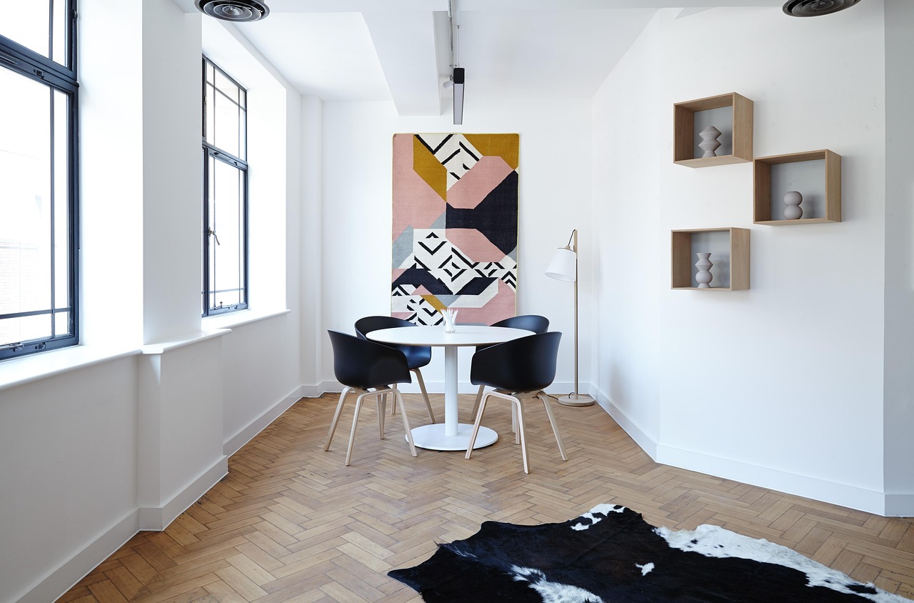
If you are looking for how to style awkward corners in home office settings, consider L-shaped floating shelves. Unlike a bulky bookcase, these shelves wrap into the corner, utilizing every inch of the 90-degree angle without consuming floor space. This is particularly effective for storing reference books or displaying small curios that would otherwise clutter your desk.
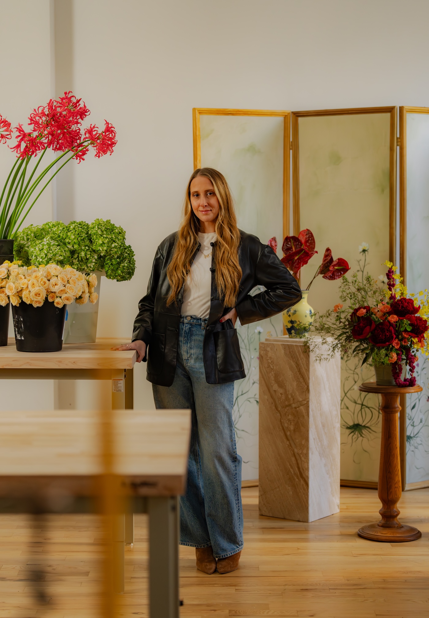
For those in a rental, renter friendly decor for empty corners can be achieved with slim plant stands or leanable mirrors. A tall, arched mirror leaned against a corner doesn't just fill the space; it uses reflective surfaces to bounce light back into the room, effectively doubling the perceived depth of the corner. If you prefer greenery, a tiered plant stand allows you to stack foliage at different heights, creating a lush focal point that respects the spatial flow of the room.
Expert Tip for 2026: Moving into next year, we are seeing a move away from "corner cabinets" toward open, sculptural pedestals. Using a single, high-quality plinth to display one piece of art creates a museum-like feel in a space that used to feel like a "junk corner."
Narrow Wall Decor Solutions for Sliver Spaces
We all have them: that ten-inch strip of wall between a window and a door, or the narrow segment at the end of a long hallway. These slivers are often where decorating ideas for small corner spaces go to die, usually in the form of a tiny, lonely picture frame that makes the wall look even smaller.
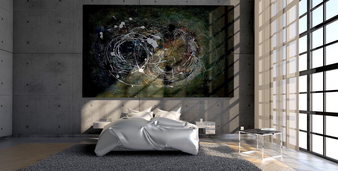
The golden rule for narrow wall decor solutions is the 50–75% width rule. To make a narrow wall look intentional, your artwork or decor should occupy at least half to three-quarters of the wall's horizontal span. If your wall is 12 inches wide, look for a vertical piece of art that is 6 to 9 inches wide. A single, large-scale piece creates much better visual weight than a cluster of small items.
For narrow wall decor solutions for hallways, consider functional aesthetics. A series of brass wall easels or a single, high-mounted sconce can add character without protruding into the walking path. When choosing art, prioritize tonal contrast. If you have cool-toned walls, a piece of art with warm ochre or terracotta tones will create a clear focal point at eye level, making the narrow wall feel like a curated gallery rather than an architectural afterthought.
| Feature | Measurement Rule | Design Impact |
|---|---|---|
| Art Width | 50% - 75% of wall width | Prevents the "lonely art" look; creates balance. |
| Mounting Height | Eye level (approx. 57-60") | Anchors the piece within the room's horizon line. |
| Depth | Under 4 inches | Maintains clear circulation in hallways. |

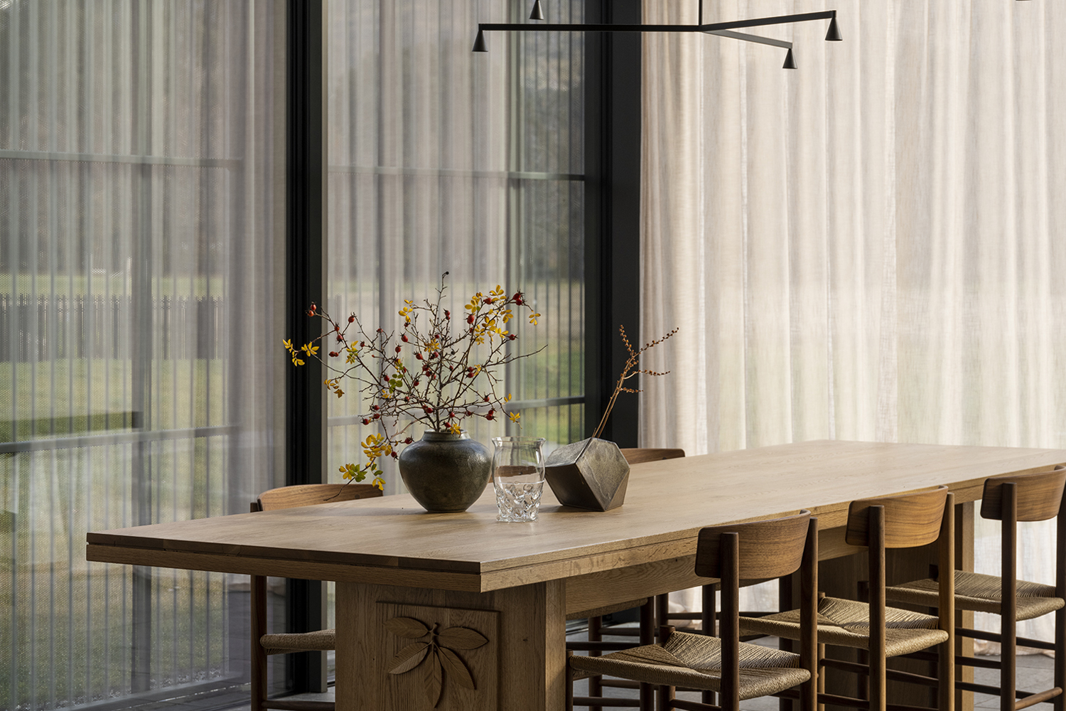
Dresser Top Styling Tips for Small Bedrooms
The top of a dresser is often the most underutilized micro-zone in a bedroom. Because space is at a premium in small bedrooms, the dresser often becomes a landing pad for keys, jewelry, and clutter. To turn this surface into a design feature, you need to apply visual weight balancing rules for blank walls and surfaces.
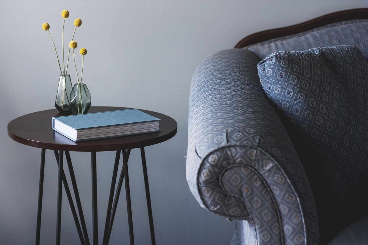
One of the most important dresser top styling tips for small bedrooms is the height limit. To maintain stability and keep the room feeling airy, keep your primary decor items under 12 inches tall. When items are too tall, they can make the dresser feel top-heavy and the ceiling feel lower. Instead of one giant vase, use a layered approach.
Start with a medium-sized leanable mirror as your backdrop. Then, overlap a smaller framed print in front of it. This creates depth through reflective surfaces without the need for permanent wall mounting—a perfect strategy for those seeking renter friendly solutions. Finish the look with a modular tray to coral smaller items. This "triad" of layers (the mirror, the art, and the tray) creates a cohesive look that feels professional and polished.

Advanced 2026 Trends: Color Drenching & Sloped Ceilings
As we look toward the 2026 design landscape, the industry is moving away from hiding awkward features and toward celebrating them. One of the most powerful tools in our arsenal is color drenching. This involves painting the walls, the baseboards, the window trim, and even the sloped ceilings in the exact same hue and finish.
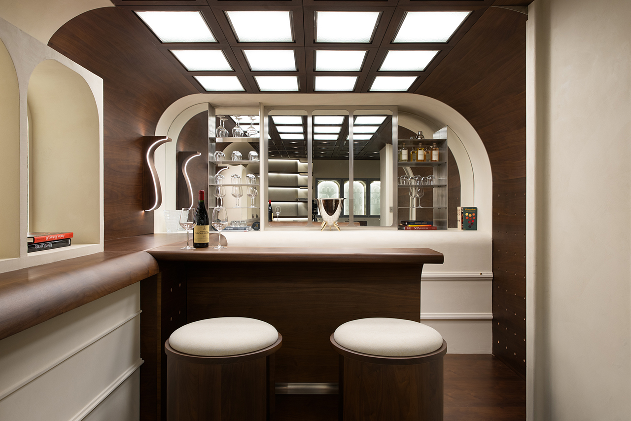
Color drenching is particularly effective for attic bedrooms or homes with irregular rooflines. By removing the high-contrast line between a white ceiling and a colored wall, you blur the boundaries of the room. The awkward angles disappear, and the space feels like a continuous, cozy cocoon. For darker transitional spaces like landings or mudrooms, I recommend using glossy textures—think Zellige tiles or high-sheen lacquer—to catch and move whatever light is available.
The demand for these types of integrated solutions is reflected in global data. As homes become more compact, the market for multi-functional and storage-focused furniture is booming. Industry projections suggest that storage-focused furniture will command a significant portion of the market, as homeowners prioritize pieces that help them manage their micro-zones more efficiently.
FAQ
How to design awkward spaces?
The best way to design awkward spaces is to first identify the dimensional threshold. For areas under 36 inches deep, focus on vertical solutions like floating shelves or tall, slim decor. Use the 50-75% rule for narrow walls to ensure art is scaled correctly. The goal is to create a micro-zone that feels intentional rather than like a leftover area, which can be achieved through consistent color palettes or lighting.
What is the 3-5-7 rule for decorating?
The 3-5-7 rule refers to the practice of grouping objects in odd numbers to create visual interest. In design, odd-numbered clusters feel more natural and less forced than even-numbered ones. For an awkward corner or a dresser top, try grouping three items of varying heights (e.g., a tall candle, a medium plant, and a small tray) to create a balanced, triangular composition.
What is the 70 30 rule in decorating?
The 70/30 rule is a guide for balancing different styles or colors within a space. Generally, 70% of a room should be in one primary style or color (often the more neutral or foundational elements), while the remaining 30% consists of a contrasting "accent" style or color. In awkward spaces, you can use this to your advantage by making 70% of the zone blend in with the walls (color drenching) and using 30% for a bold, sculptural piece of art.
What not to do when decorating?
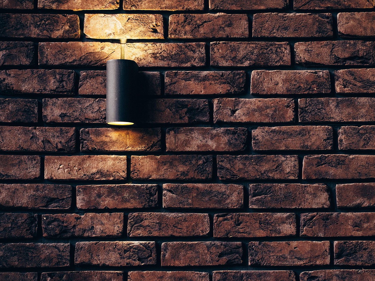
One of the biggest mistakes is pushing all your furniture against the walls in an attempt to "open up" the floor. This often highlights awkward corners and makes the room feel like a waiting area. Avoid using undersized rugs or art, as they emphasize the smallness of the space. Lastly, don't ignore the lighting; a dark corner will always look awkward, no matter how much decor you add. Ensure every micro-zone has its own light source, whether it is a sconce, a floor lamp, or reflected natural light.