There’s a specific kind of magic that happens when a home stops being a collection of static rooms and starts being what architects call a "living system." We have all stepped into apartments that feel smaller than their square footage—cluttered by unnecessary walls and darkened by heavy furniture. But then, there is the SBC Apartment. Located in the heart of a bustling urban center and designed by the visionary Studio Papaya, this 538-square-foot sanctuary defies the laws of visual physics.
How can a 538-square-foot apartment feel huge? The secret lies in replacing physical partitions with varied floor finishes and utilizing double-height volumes to create visual depth. By treating the floor plan as a fluid landscape rather than a series of boxes, the designers have maximized every inch, turning a micro-footprint into a breathable, multifunctional retreat. This isn't just a home; it’s a masterclass in modern living.
1. Defining the 'Living System' Philosophy
In the world of interior styling, we often talk about "zoning." Traditionally, this meant putting up a wall or a folding screen. However, the SBC Apartment introduces us to a more sophisticated approach: the Living System. This philosophy suggests that a home should adapt to the inhabitant's movements throughout the day, rather than forcing the inhabitant to fit into rigid rooms.
By moving away from static rooms, Studio Papaya utilized bespoke joinery to bridge the gap between furniture and architecture. In a space this size, every millimeter counts. Statistics show that incorporating bespoke joinery and vertical storage solutions can increase usable storage efficiency by up to 35% compared to standard modular furniture layouts. When storage is built into the very bones of the apartment, the floor remains clear, and the eye is allowed to travel further, creating the illusion of boundless space.
2. The Entryway & Visual Thresholds
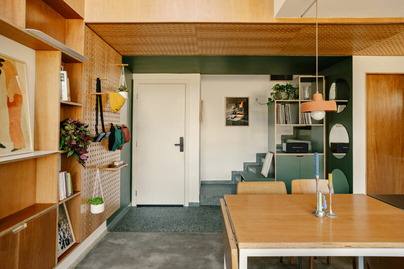
First impressions are everything, especially in small-scale living. The SBC Apartment uses what I like to call "The Psychology of the Green Threshold." Instead of a cramped hallway, the entry is defined by a bold, sage-green volume. This isn't just a color choice; it’s a functional anchor that houses the "mess" of daily life—coats, keys, and shoes—behind seamless panels.
The transition from the vibrant green entry to the light-filled living area creates a "release" sensation. This ritual of arrival helps the mind reset. By integrating custom wooden screens, the designers allow light to filter through the entryway while maintaining a sense of privacy. This ensures that the moment you step inside, you aren't looking at a kitchen sink or a bed, but rather a curated view that draws you deeper into the home.
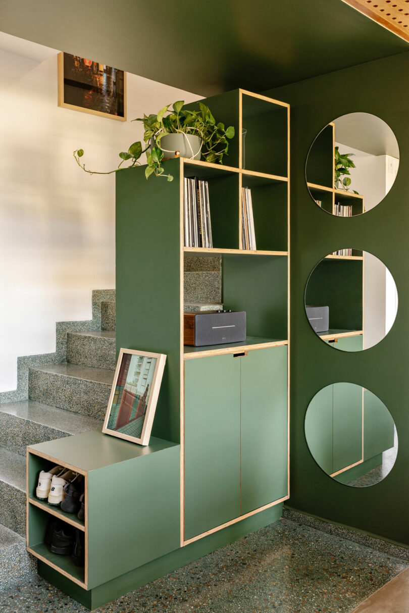
Ivy’s Style Tip: In small apartments, don't be afraid of "hero colors." A single, saturated hue in a transitional space (like an entryway) can actually make the adjacent rooms feel brighter and more expansive by comparison.
3. Multifunctional Hub: The Sliding Table and Flexible Kitchen
The heart of the SBC Apartment is a lesson in agility. The kitchen isn't just for cooking; it’s a social hub, a workspace, and a dining room. This is made possible by a custom sliding dining table that nests into the kitchen island.
- During the day: The table is tucked away, providing extra prep space and keeping the floor plan open for movement.
- During dinner: The table slides out to accommodate four guests comfortably.
- For work: It moves to an optimal position near the window, capturing natural light for deep focus.
The material palette here is equally strategic. Pale plywood edges paired with light-reflecting stainless steel and white cabinetry allow the kitchen to "recede" into the walls. Notice how the floor finish changes slightly between the cooking area and the lounge; this subtle shift in texture serves as an invisible boundary, organizing activity without the need for a single wall.
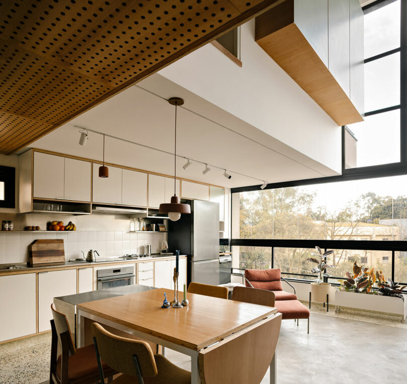
4. Vertical Expansion: The Mezzanine Advantage
When you run out of floor space, the only way to go is up. The SBC Apartment brilliantly utilizes its double-height volumes. In many micro-apartments, high ceilings are wasted space. Here, the inclusion of a mezzanine level effectively adds 20% more functional living area without expanding the building's physical shell.
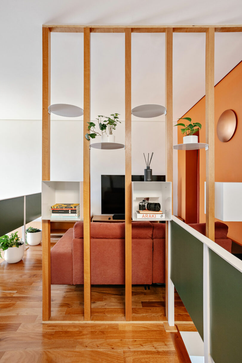
This mezzanine serves as a private sleeping loft or a quiet reading nook, physically separated from the social energy of the lower floor. To prevent this upper level from feeling like a "box in a box," Studio Papaya used slatted dividers. These wooden slats are a designer's best friend in 2026. They provide:
- Privacy: Obscuring the view of the bed from the living room.
- Light Flow: Allowing sunlight from the large windows to reach the back of the loft.
- Sightlines: Ensuring the occupant upstairs still feels connected to the volume of the entire apartment, preventing a cramped feeling.
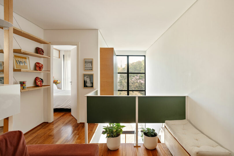
5. 2026 Smart Storage: Hidden Solutions
Storage in a small space should be felt, not seen. The SBC Apartment utilizes a "Vertical Void" wardrobe system—a floor-to-ceiling custom millwork unit that blends into the architecture. Unlike modular furniture which often leaves "dead space" at the top or sides (where dust and clutter accumulate), bespoke solutions utilize every cubic inch.
| Feature | Modular Furniture | Bespoke SBC Joinery |
|---|---|---|
| Space Efficiency | 65-70% | 95-100% |
| Visual Clutter | High (gaps & mismatched heights) | Low (seamlessly integrated) |
| Multifunctionality | Single purpose | Integrated desks/lighting/hidden tech |
| Longevity | Medium (disposable) | High (built into the home structure) |
One of the smartest features is the use of the stairs leading to the mezzanine. Each step is a drawer, and the space beneath the staircase is a deep closet. This "hidden in plain sight" approach is what keeps the 538 square feet feeling like a sprawling loft.
6. Visual Expansion Techniques (The Ivy_Home Style)
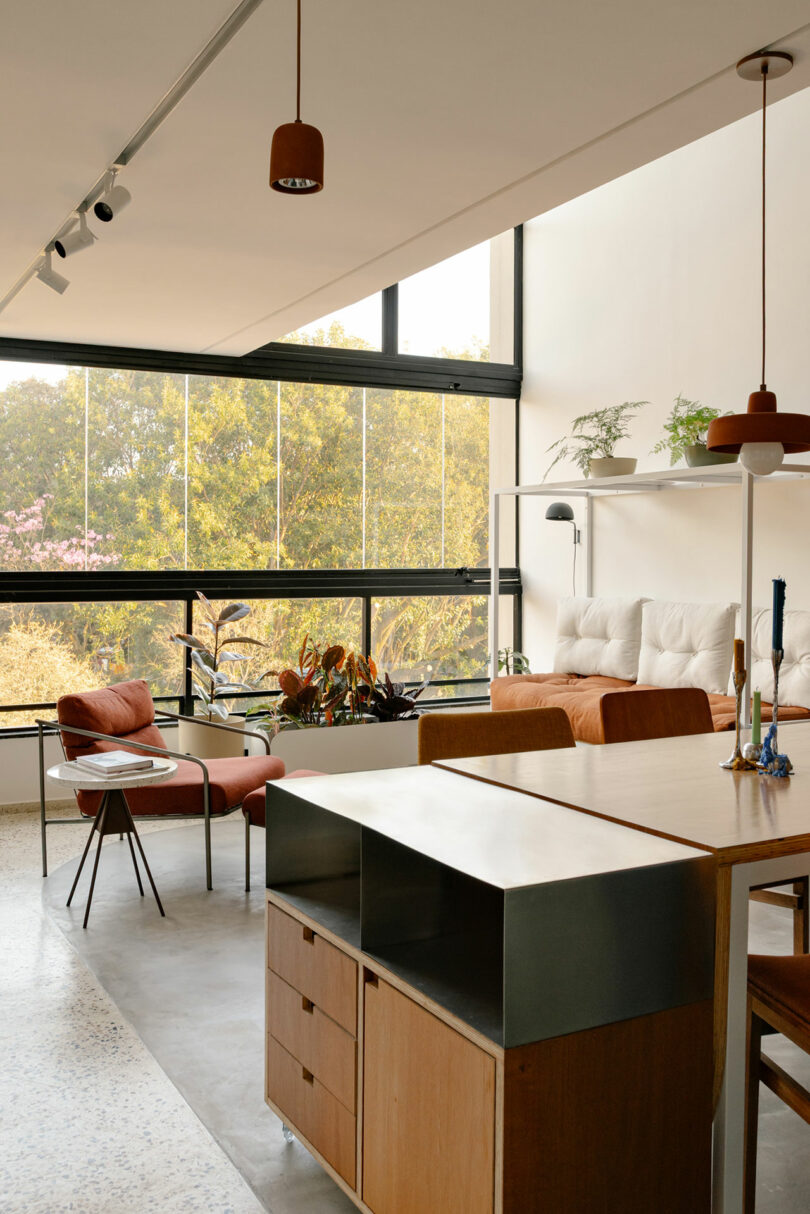
Beyond the architecture, there are styling techniques I always recommend to my readers to help a space "breathe." In the SBC Apartment, we see the "Path Test" in action. This involves mapping out the circulation routes to ensure there is a clear, unobstructed path from the entry to the windows. If you have to zigzag around furniture, the space will feel small.
Another key technique is the use of Floating Furniture. Notice how the cabinetry is often lifted slightly off the floor or lacks heavy bases. Seeing more of the floor creates "visual air," tricking the brain into perceiving more room.
Finally, let’s talk about the connection to the outdoors. The SBC Apartment features large, expansive windows that act as "borrowed scenery." By keeping window treatments minimal and placing mirrors strategically opposite these windows, the interior world merges with the exterior, making the walls feel like they’ve simply disappeared.
FAQ: Navigating Small Space Living in 2026
Q: Is bespoke joinery worth the investment in a rental? A: While permanent millwork is usually for owners, renters can achieve a similar look with floor-to-ceiling modular units that are "hacked" with filler panels to look built-in. The 35% storage increase is a game-changer for quality of life.
Q: How do I choose a color palette for a 500-sq-ft space? A: Follow the 60-30-10 rule but keep the 60% (walls/floors) in a light, reflective tone. Use your 30% for a "zoning" color (like the SBC green) and the 10% for tactile accents like wood or metal.
Q: Does a mezzanine make a room feel shorter? A: Not if you use the "slatted" technique. By keeping the mezzanine edges open and using transparent or slatted barriers, you maintain the vertical height of the room while gaining floor area.
Conclusion
The SBC Apartment proves that luxury isn't about square footage—it’s about the intelligence of the layout and the quality of the materials. By treating your home as a "living system" rather than a storage unit for your belongings, you can create a space that nurtures your lifestyle.
Whether you are living in 500 square feet or 5,000, the principles remain the same: prioritize light, eliminate visual noise, and ensure every piece of furniture earned its place. Are you ready to take the "Path Test" in your own home?