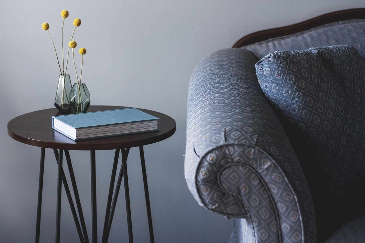
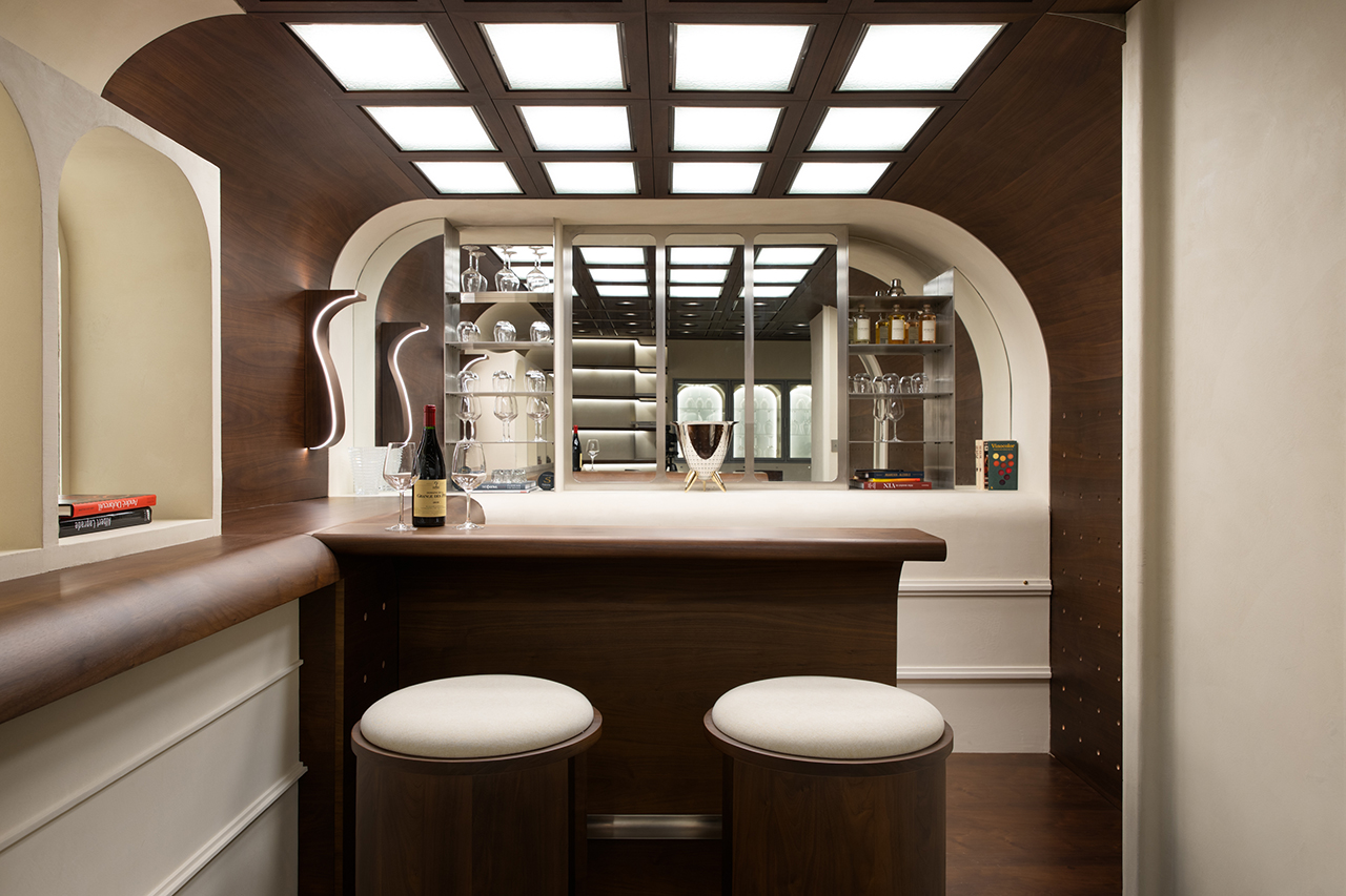
For years, the interior design world has been under the spell of "gallery white"—the belief that a space is only modern if it feels surgically clean and pristinely neutral. But as we look toward the 2026 season, that icy minimalism is finally thawing. We are entering the era of the "cocooning" interior, where the goal isn't just to look at a room, but to feel enveloped by it. Internal data analysis reveals a staggering 45% increase in searches for "moody living room" aesthetics over traditional minimalist neutrals as we approach the 2026 season. Homeowners are no longer seeking the bright and airy; they are craving the deep, the saturated, and the intimate.
The 2026 living room color trends represent a sophisticated departure from the expected. We are seeing a surge in rich, organic pigments—think mulberry, walnut, moss green, and dark chocolate. These palettes are designed to foster connection and rest, turning the living room back into a sanctuary rather than a showroom. By embracing these modern seasonal color stories, you can transform a sterile space into a high-end retreat that feels both curated and profoundly lived-in.
I. Five Curated Color Stories to Elevate Your Space
1. Soft Citrus & Warm Woods (The Uplifting Winter Palette)
While the broader trend leans moody, the "Soft Citrus & Warm Woods" story provides a necessary counterbalance for those who desire light without the coldness of white. This palette is an evolution of "Scandi-boho," but with more intentionality and warmth. It relies on the interplay between citrus-inspired tones and the architectural grounding of natural timber.
- Key Elements: Muted tangerine, pale marigold, soft honey, and natural oak or walnut.
- The Foundation: Start with honey-toned wood flooring or large-scale furniture.
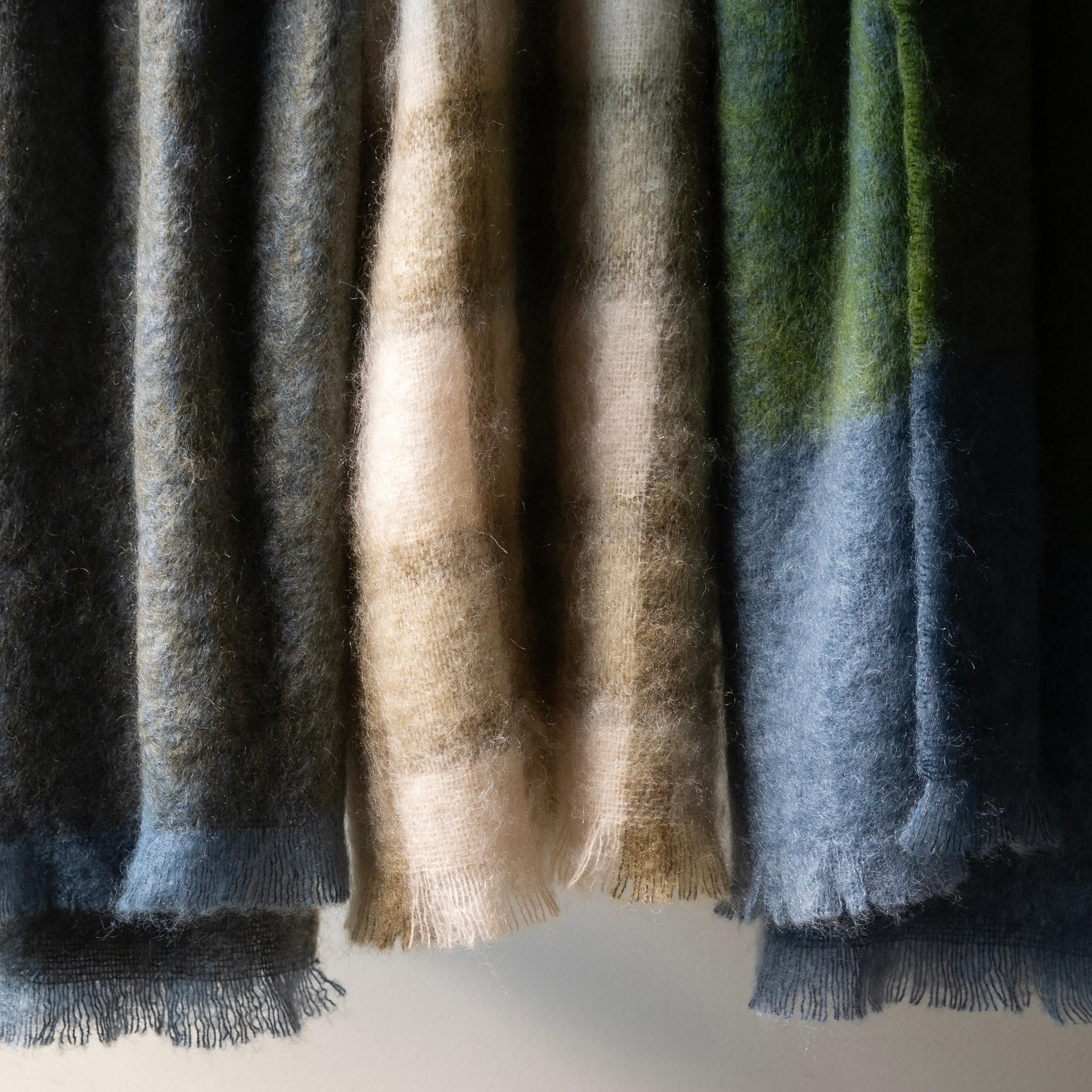
- The Accent: Introduce citrus through "nubby" mohair throws or matte ceramic vases.
Designer’s Insight: To keep this look sophisticated rather than "fruity," ensure your citrus tones are dusty or desaturated. A muted tangerine velvet armchair against a walnut-paneled wall creates a sun-drenched atmosphere even on the grayest winter afternoon. Avoid high-gloss finishes; the goal here is a soft, tactile glow.
2. Moss, Charcoal & Deep Clay (The Moody Minimalist)
For those ready to embrace the dark side, this palette offers a masterclass in "Moody Minimalist" design. It moves away from the flat grays of the last decade and introduces earthy, complex pigments that change throughout the day. Moss green acts as the primary neutral here, providing a sense of life and growth even in a shadowed room.
- Key Elements: Earthy moss green, charcoal, and rusty sienna or deep clay.
- Texture Pairing: This palette demands heavy textures—think boucle, slate, and patinated metals.
- The Vibe: An overgrown, forest-floor aesthetic that feels grounded and incredibly private.
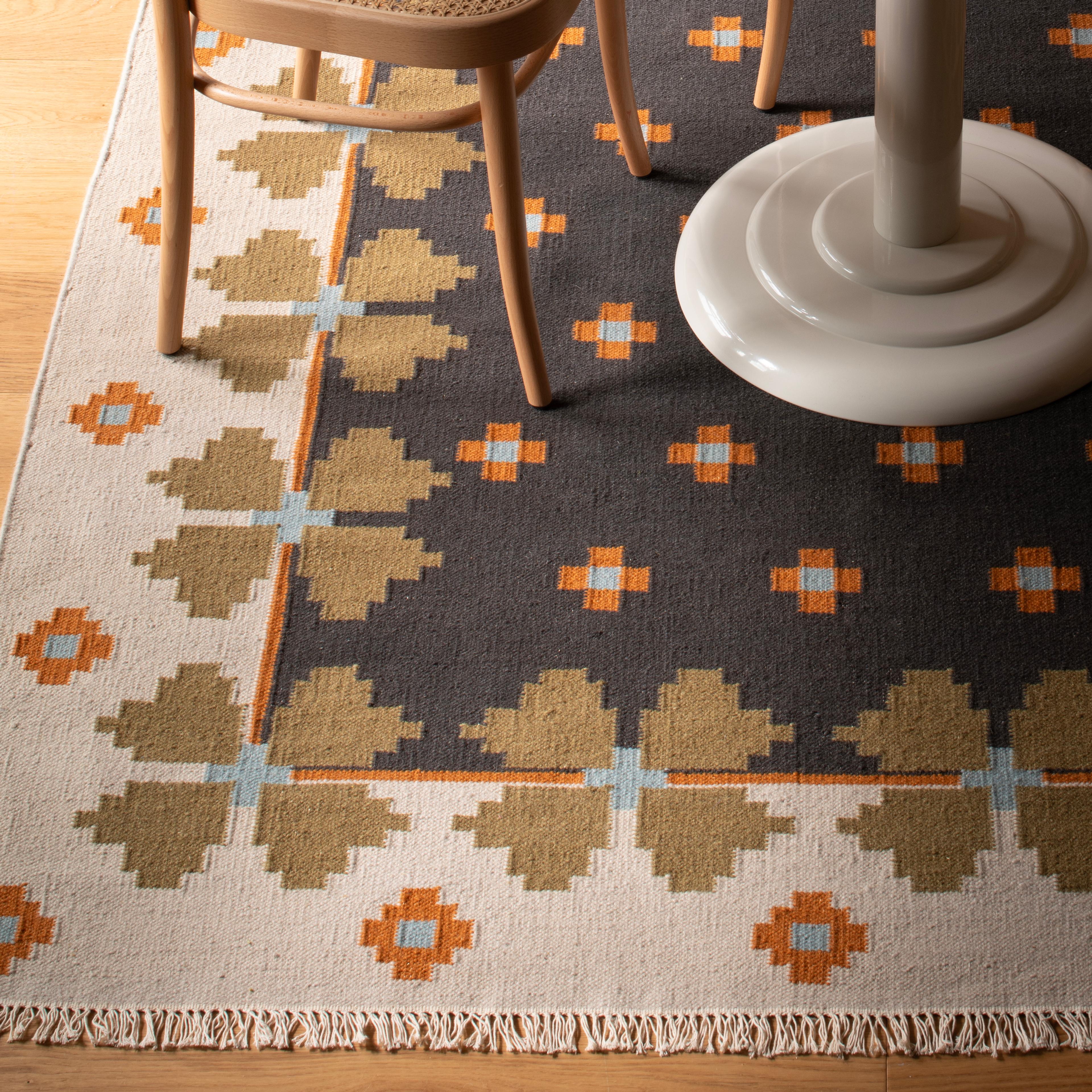
When working with these darker moody interior design palettes, the floor becomes a critical canvas. A deep charcoal rug with organic patterns can anchor the greens and clays, preventing the room from feeling like it’s "floating" in darkness.
3. Mulberry, Walnut & Smoke (The New Rich Neutral)
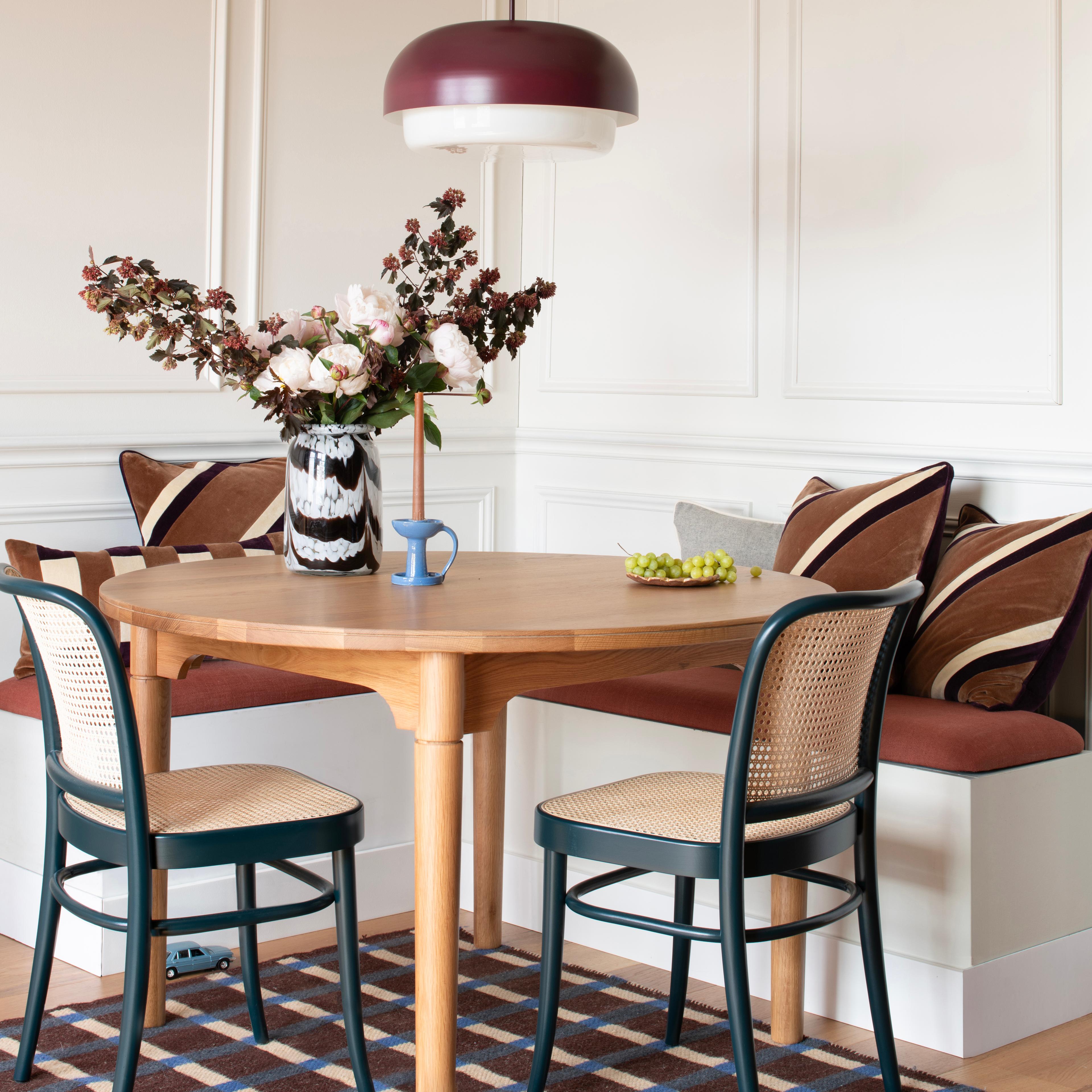
If 2025 was about "quiet luxury," 2026 is about "expressive heritage." The combination of mulberry and walnut creates a "New Rich Neutral" that feels historic yet entirely fresh. Mulberry—a sophisticated purple-red with gray undertones—is the breakout star of the season, offering a warmth that traditional navy or forest green lacks.
- Key Elements: Deep berry (mulberry/raisin), dark walnut wood, and smoky grays.
- Why it works: It provides depth and drama without relying on the cliché "seasonal" colors like bright red or emerald green.
- Styling Tip: Pair a mulberry-colored velvet sofa with dark wood side tables and smoked glass lighting fixtures.
This story is particularly effective in rooms with high ceilings or original architectural moldings, as the dark berry tones highlight craftsmanship and create a sense of permanent, "old-money" elegance.
4. Icy Blue & Soft Buttercream (The Airy 'Near-Neutral')
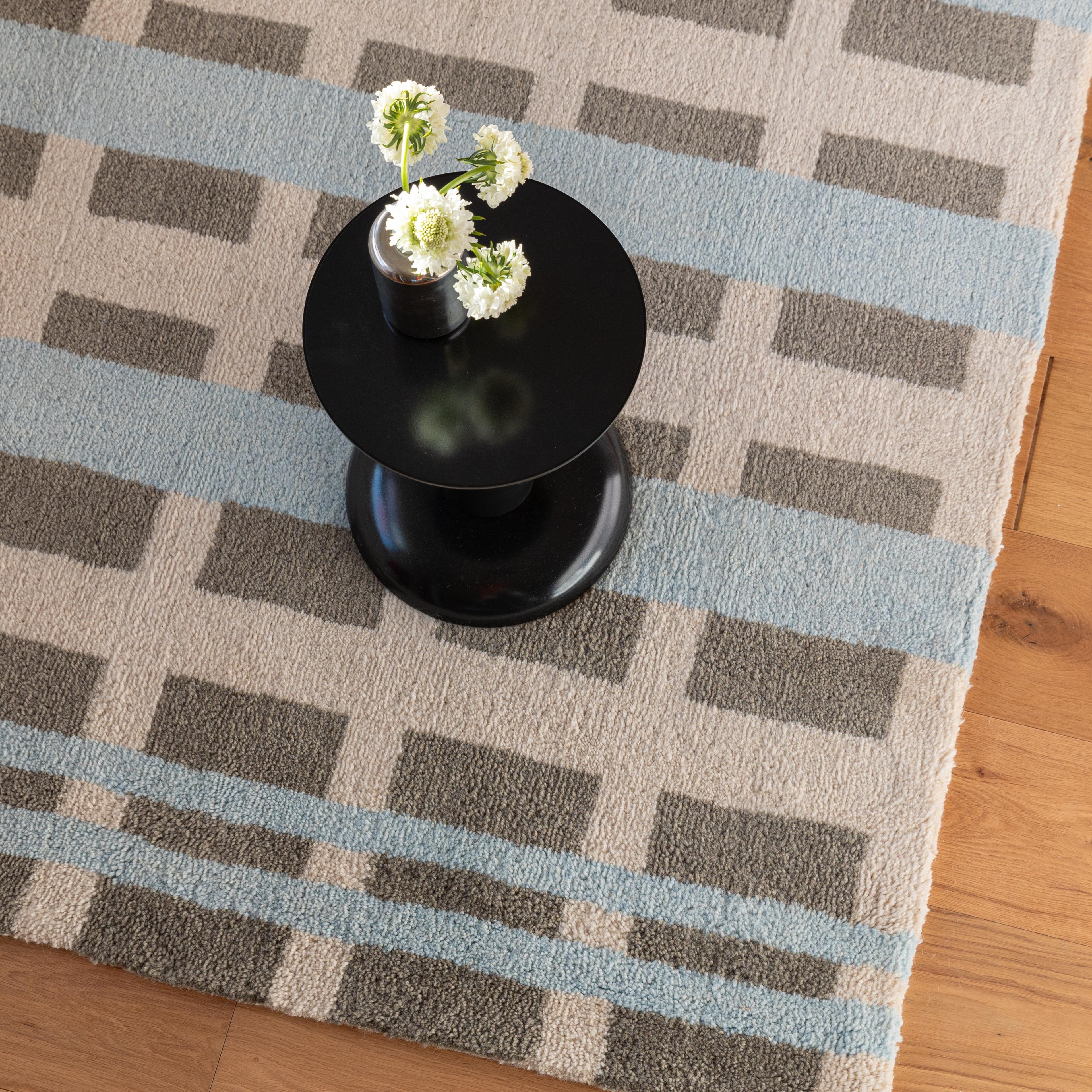
For those who find the "cocooning" trend a bit too heavy, the "Icy Blue & Soft Buttercream" story offers a breath of fresh air. This is what designers call a "near-neutral" palette. It’s calm, wintry, and incredibly serene, mimicking the light of a crisp daybreak.
- Key Elements: Wintry icy blue, warm buttercream, and brushed silver.
- The Contrast: The "warmth" comes from the buttercream (which replaces stark white), while the "cool" comes from the blue.
- Material Pairing: Layer with clear glass and polished chrome or brushed silver to maintain a light, airy aesthetic.
Designer’s Insight: This is the perfect palette for a seasonal living room refresh that bypasses traditional motifs. Instead of pine needles and holly, use oversized buttercream knit blankets and icy blue silk cushions to create a sophisticated winter wonderland that lasts long after the holidays.
5. Sienna, Sage & Chalk White (The Balanced Organic)
The final story for 2026 is rooted in the "Slow Decorating" movement. "Sienna, Sage & Chalk White" is an organic, artisanal palette that feels gathered over time rather than bought in a single afternoon. It celebrates the imperfections of natural materials.
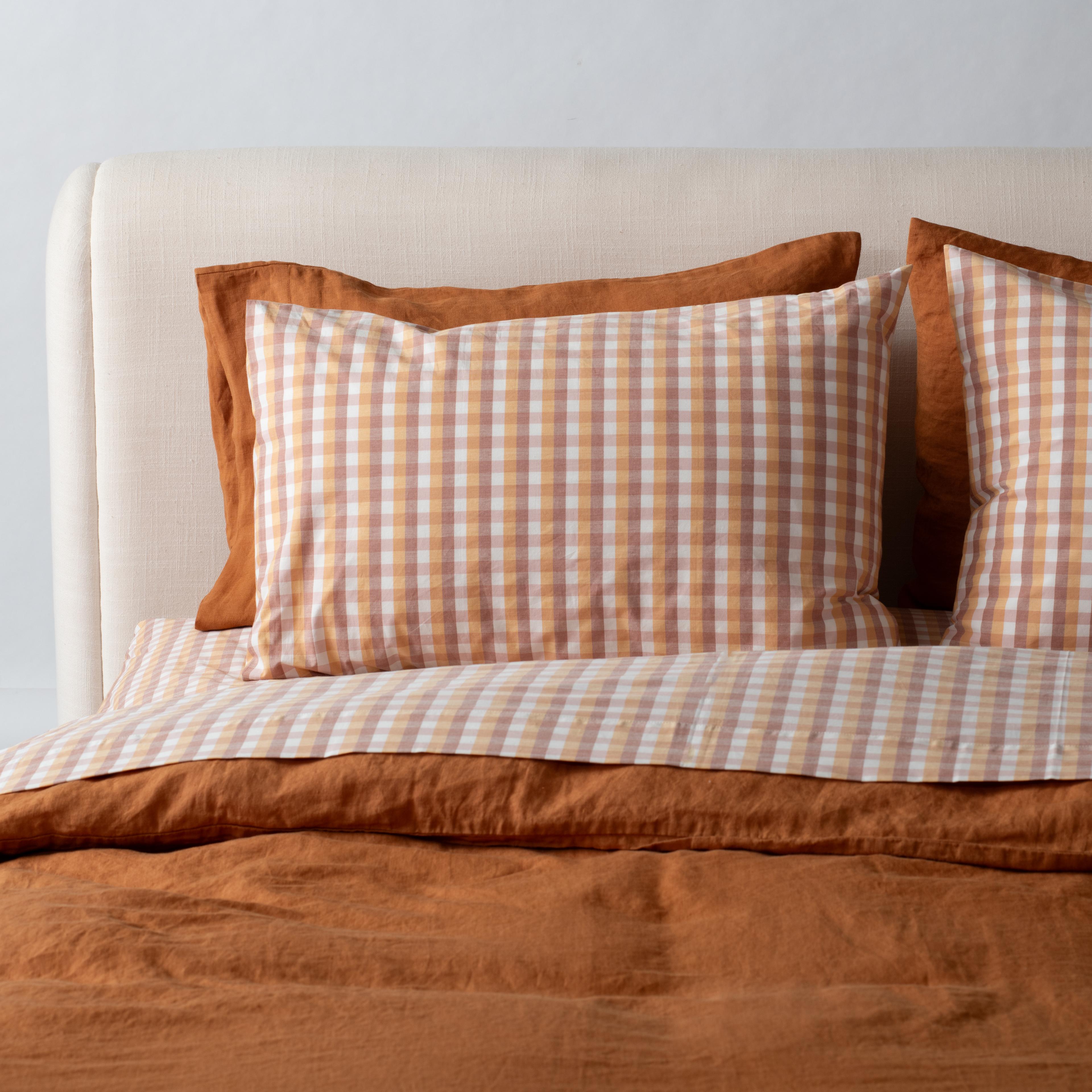
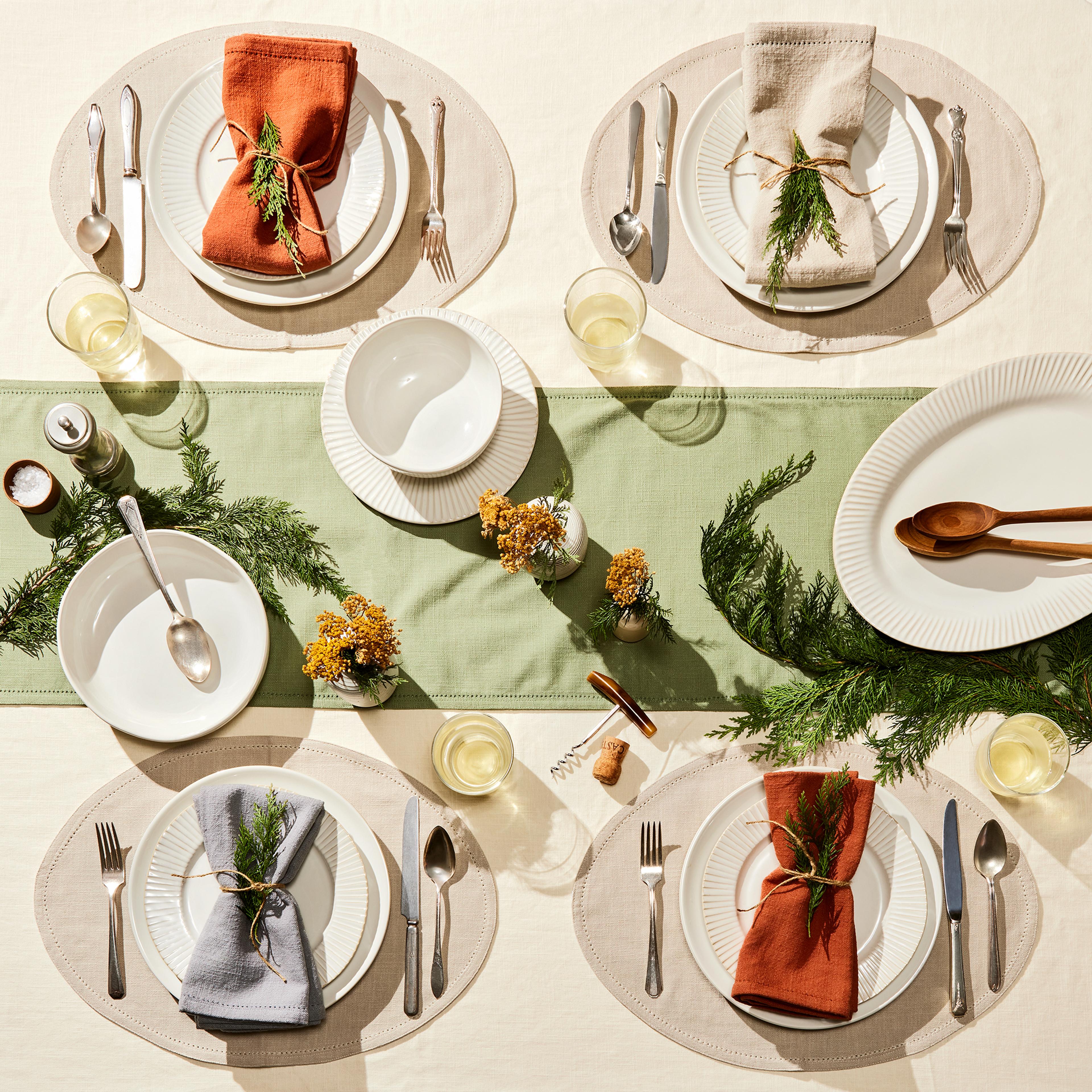
- Key Elements: Warm sienna (terracotta), calming sage, and bright chalk white.
- Application: This palette translates beautifully to everyday textiles—think sage-colored linen curtains and sienna-striped wool rugs.
- The Finish: Use chalk white on the walls to provide a clean, matte backdrop that allows the earthy tones to sing.
This combination is particularly successful in multifunctional spaces where the living room blends into a dining area. The sage and sienna tones are appetite-stimulating yet calming, making the transition between lounging and dining feel seamless and intentional.
II. Advanced 2026 Styling: Beyond the Walls
Creating a 2026-ready living room requires more than just a new coat of paint. Designers are now looking at the architecture of the room—and the floor beneath our feet—to create truly three-dimensional spaces.
Color Capping: The New Gradient Technique
While "color drenching" (painting everything one color) has been popular, the color capping technique is the more nuanced alternative for 2026. This method involves using varying tones from the same color family to create a layered gradient.
By applying a darker, more saturated tone near the ceiling or across the coving and then transitioning to a lighter version of the same hue as you move down the wall, you draw the eye upward and add architectural dimension. It creates a "capped" look that makes the room feel taller and more structured, serving as a modern way to introduce depth without the commitment of a dark accent wall.
Texture-Maxxing and Layered Rug Styling 2026
Recent design surveys indicate that 72% of interior professionals now prioritize "layered textures" and "personalized parlors" over open-concept layouts. In the living room, this trend is best expressed through the floor.
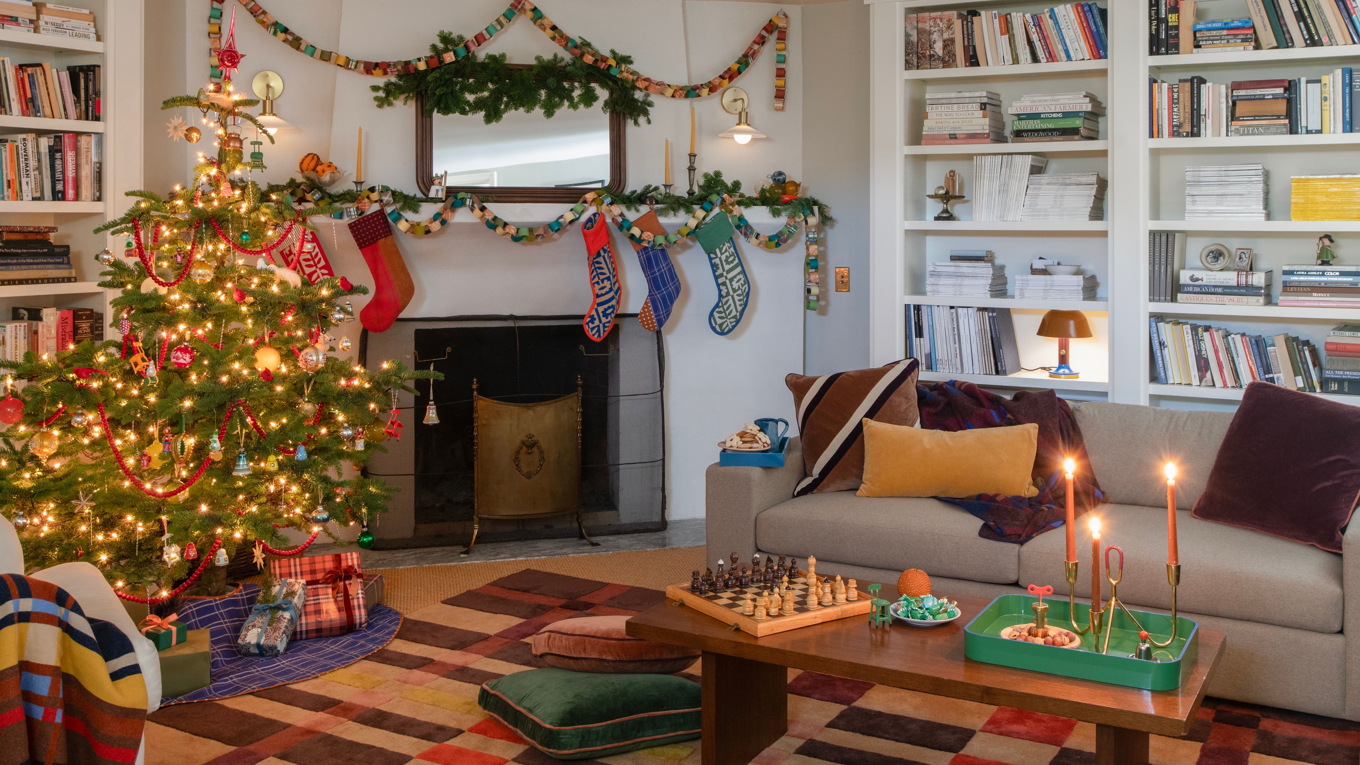
To achieve layered rug styling 2026, move away from the single, oversized area rug. Instead, start with a large, neutral-fiber base—such as a seagrass or jute rug—to establish a sense of scale and natural texture. Then, layer a smaller, high-pile vintage rug or a textured wool piece on top. This creates a "nesting" effect under the coffee table, immediately making the seating area feel more intimate and focused.
III. The Return of the 'Personalized Parlor'
The most significant shift we see in 2026 isn't just a color; it’s a lifestyle. We are seeing the death of the TV-centric room in favor of the "Personalized Parlor"—a multifunctional salon designed for analog socializing.
Designers are increasingly asked to create spaces that favor conversation over screen time. This means:
- Symmetric Seating: Placing sofas or chairs facing each other rather than the television.
- Statement Lighting: Replacing generic recessed lights with sculptural pendants that act as "jewelry" for the room.
- Curated Collections: Displaying heirlooms, art books, and travel finds that tell a personal story.
This "slow decorating" approach ensures that your living room doesn't just follow a trend, but reflects your personality. When you combine a moody mulberry palette with layered rugs and a curated collection of art, you aren't just decorating; you are building a legacy space.
FAQ
1. How do I transition to a moody palette without making my room feel small? The key is lighting and "color capping." By using a lighter tone on the upper third of the wall or the ceiling, you prevent the dark colors from "closing in." Additionally, ensure you have multiple layers of light—ambient, task, and accent—to create pockets of warmth within the darker space.
2. Is "Color Drenching" still in for 2026? While color drenching remains a strong tool, 2026 is moving toward more tonal variation. Instead of one flat color on every surface, use the "color capping technique" or subtle shifts in finish (e.g., matte walls with a high-gloss trim in the same family) to add more visual interest and professional polish.
3. What is the most versatile color to start with for a 2026 refresh? Moss green is arguably the most versatile of the 2026 living room color trends. It acts as a "new neutral" that pairs beautifully with existing woods, leathers, and even metallic accents, making it an easy entry point for those moving away from all-white interiors.