Quick Facts
- Project Name: Rock Capital Headquarters
- Location: Metropolitan Building, Warsaw, Poland (Foster + Partners design)
- Interior Architect: BIT CREATIVE Barnaba Grzelecki
- Total Area: 4,951 Square Feet (460 Square Meters)
- Core Concept: A "Gallery-Inspired" office blending architecture and fine art.
- Key Artistic Collaborator: Lukasz Stokowski (Custom-commissioned canvases)
- Defining Features: Curved walls, mirrored structural columns, and a 1-to-1 visual dialogue with the building's exterior.
The traditional office is undergoing a profound metamorphosis. For decades, the workplace was defined by serviceable utility—fluorescent lighting, rigid cubicles, and a distinct lack of soul. However, as we navigate an era where the "office" must compete with the comforts of home and the inspiration of the outside world, designers are looking toward the high-end art gallery for a new blueprint. In Warsaw’s prestigious Metropolitan building, the collaboration between BIT CREATIVE and developer Rock Capital has resulted in a 4,951-square-foot masterpiece that transcends corporate norms. This is not just a place for financial transactions; it is a curated experience where boutique commercial office architecture meets the evocative power of contemporary art.
The Philosophy of the 'Office Gallery'
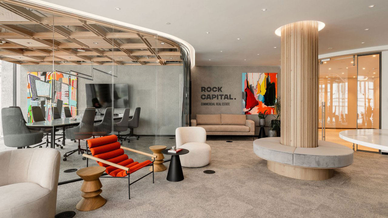
At the heart of the Rock Capital headquarters lies a fundamental question: How can a workplace function as a gallery without losing its operational efficiency? The BIT CREATIVE team answered this by treating the entire 4,951-square-foot footprint as a minimalist backdrop. By utilizing a restrained palette of cream, beige, and soft gray tones, the architects created a "quiet" environment that allows vibrant, custom-commissioned canvases by artist Lukasz Stokowski to speak.
Incorporating art into office design is no longer a decorative afterthought—it is a strategic choice for "digital detoxification." In a world dominated by screens, the presence of tactile, large-scale art provides a necessary visual anchor. These 100% custom-commissioned artworks stimulate creativity by offering employees a chance for visual exploration, effectively using emotional design elements to foster a sense of identity and motivation. The office becomes a living exhibition, where every corridor and meeting room tells a story.
Architectural Dialogue: Exterior Arches to Interior Curves
The Metropolitan building, designed by the world-renowned Foster + Partners, is an architectural landmark near Warsaw’s Pilsudski Square. Its distinctive curved facade and rhythmic arches are iconic elements of the city's skyline. BIT CREATIVE’s genius was in establishing a 1-to-1 visual dialogue between these external geometries and the interior layout.
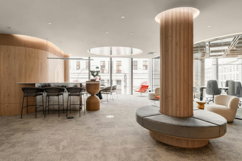
By referencing the building's distinctive exterior, the interior design achieves a seamless continuity. The office utilizes curved walls and softened corners that mirror the Metropolitan’s footprint. This isn't just aesthetic; it’s a psychological move. Curves promote fluidity and movement, breaking the "grid" mentality often found in corporate settings.
Expert Insight: "When an interior echoes its architectural shell, the result is a sense of inevitability and calm. In the Rock Capital project, the curves aren't just decorative—they are a tribute to the building's DNA." — Ivy Chen
Reimagining the Entrance: The Mirrored Social Hub
The first impression of the Rock Capital office is a departure from the expected. Most boutique commercial offices lead with a heavy, monolithic reception desk. Instead, BIT CREATIVE replaced the traditional reception with a mirrored structural column. This bold choice achieves two things: it visually doubles the perceived space and eliminates the barrier between the "visitor" and the "staff."
The entrance zone flows naturally into a social kitchen and lounge area. Mirrored ceilings are used strategically here to reflect light and the movement of people, creating a dynamic, social atmosphere. This hub is designed for interaction, serving as a transitional space that feels more like a luxury hotel lobby or an art collector's private lounge than a transactional front desk.
The Material Palette: A Minimalist Backdrop
To allow the art to take center stage, the selection of materials had to be impeccable yet understated. The BIT CREATIVE team leaned into textures that feel organic and high-end.
| Material | Application | Design Impact |
|---|---|---|
| Sintered Stone | Custom Conference Tables | Mimics natural rock formations; adds tactile luxury. |
| Water-like Laminate | Accent Walls/Furniture | Reflects light subtly, adding a "fluid" dimension. |
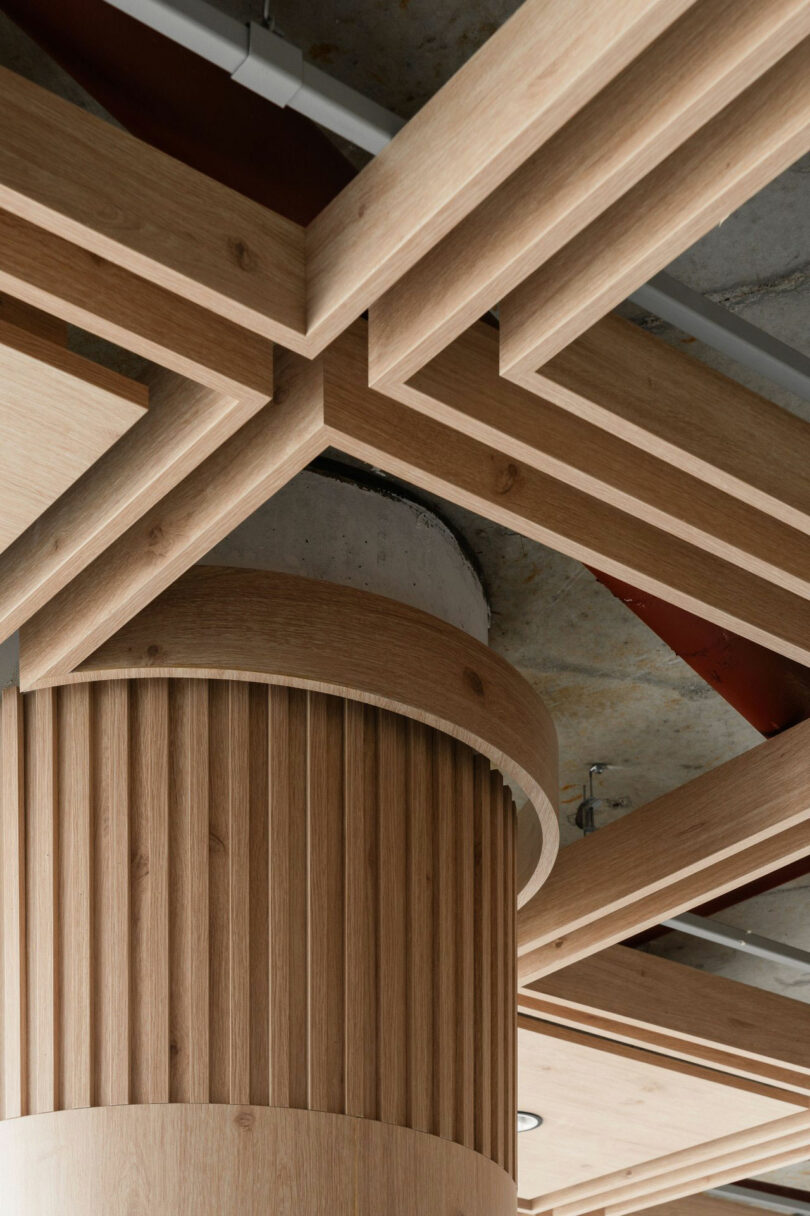
| Slatted Ceilings | Acoustic & Lighting | Integrates LED strips while providing acoustic dampening. |
| Concrete & Wood | Flooring & Millwork | Creates a balance between industrial cool and organic warmth. |
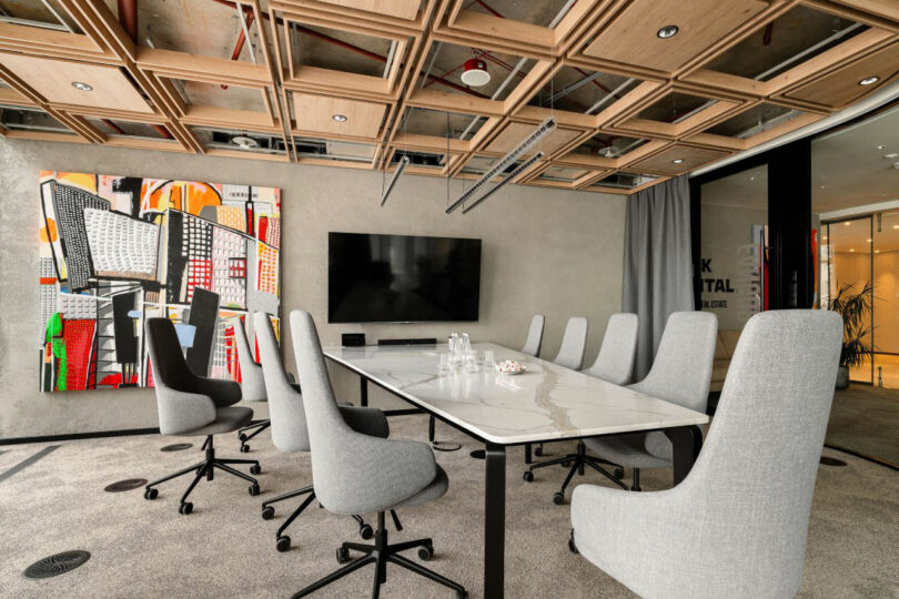
Spotlight: The Sintered Stone The use of sintered stone for the tables in the main conference rooms is a direct nod to the company name, "Rock Capital." These pieces are custom-crafted to look like natural outcrops, grounding the ethereal art pieces with a sense of geological permanence.
Curated Functional Spaces: From 'Dali' to 'Banksy'
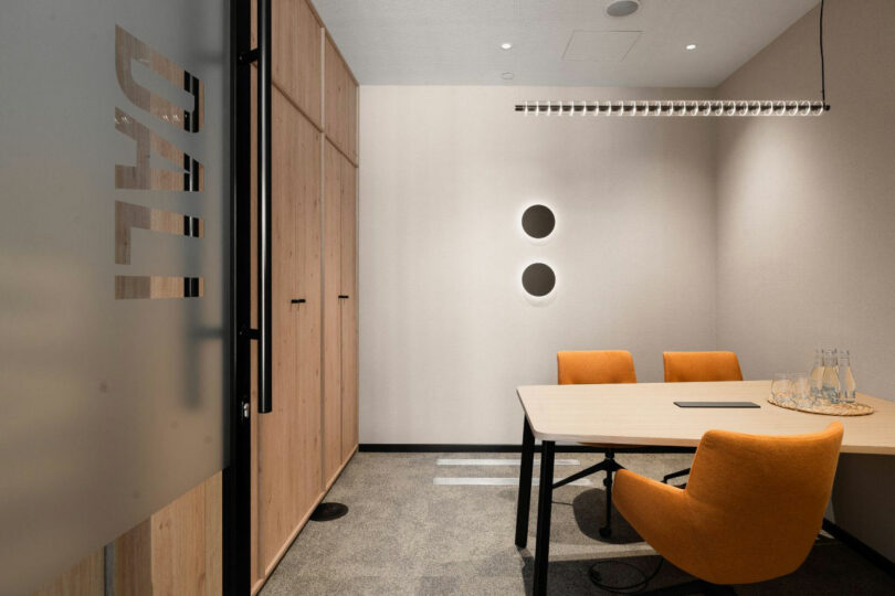
Naming rooms is a common practice, but at Rock Capital, it’s a tribute to the CEO Jakub Linka’s personal passion for art. The meeting rooms are not merely "Room A" or "Room B"; they are the Salvador Dalí and Banksy rooms.
The 'Dali' room, in particular, showcases a boutique feel that balances ergonomic requirements with bold, playful design. Here, the lighting is meticulously designed to mimic gallery-level presentation. Slatted ceilings with integrated LEDs ensure that while the workspace is functional for high-level meetings, the artwork remains the focal point. This curation enhances employee motivation, as every space they inhabit feels intentional and special.
The lighting design throughout the office is a masterclass in layered illumination. Rather than uniform overhead panels, BIT CREATIVE used a mix of:
- Integrated LED Strips: Hidden within ceiling slats to provide ambient glow.
- Directional Spotlights: Aimed specifically at the Stokowski canvases.
- Reflective Surfaces: Using mirrors and polished stones to bounce light into darker corners.
How to Integrate Art into Your Boutique Commercial Office
You don't need a 5,000-square-foot footprint in a Foster + Partners building to apply these principles. Whether you are styling a home office or a corporate suite, consider these "Ivy Chen" design tips:
- Prioritize the "Gallery White" (or Cream): Choose a wall color that supports, rather than competes with, your art. A slightly warm white or soft beige (like those used in the Rock Capital project) feels more sophisticated and "lived-in" than a stark clinical white.
- Define Social Zones: Modern work is collaborative. Replace a formal lobby with a "Social Heart." Use comfortable seating, a high-quality coffee station, and one "hero" art piece to anchor the space.
- Invest in Scaled Art: Small, scattered pictures often look cluttered. Opt for one or two large-scale canvases that command the room. This creates a sense of luxury and focus.
- Lighting as an Art Form: Use warm-toned LEDs and dimmable options. Being able to change the mood of a room from "high-productivity" to "intimate lounge" is the hallmark of modern boutique design.
FAQ
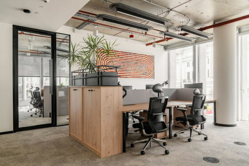
What are the most common materials for a modern boutique office? Boutique offices often favor a mix of "honest" materials. You will typically see a combination of natural wood (oak or walnut), industrial accents like concrete or fluted glass, and high-performance surfaces like sintered stone or quartz. The key is the juxtaposition of hard and soft textures.
How does workplace design impact employee retention? Research shows that employees are more likely to stay with a company that provides an environment reflecting their values. An art-filled, thoughtfully designed office signals that the company values creativity, mental well-being, and a high standard of excellence, which fosters a stronger sense of professional identity.
Can a small office space implement a gallery theme? Absolutely. In fact, a gallery theme can make a small office feel larger. By using mirrored surfaces to create depth and a neutral color palette to open up the space, you can use art as a "window" to add character without adding physical clutter.
In the end, BIT CREATIVE’s design for Rock Capital reminds us that the workplace is not just where we work—it is where we think, dream, and create. By turning the office into a gallery, they have turned the daily grind into a curated journey of inspiration.