We have all felt that subtle, mounting claustrophobia that comes with living in a compact city apartment. I often describe small-space living to my clients as a "daily puzzle"—a delicate balancing act between the furniture we need and the airiness we crave. For years, the standard advice was simple: "Paint it white and buy a mirror." But as we look toward the design landscape of 2026, the strategy has evolved from mere survival to a sophisticated, intentional manifesto of light.
Nowhere is this more evident than in Vlad Kudin’s "Blondie Space" in Minsk. This 70-square-meter apartment is a masterclass in what I call "The New Minimalism." It doesn’t just avoid clutter; it actively invites luminosity into every corner. To maximize light in a small home today, we must adopt a minimalist palette of matte whites and light greys, eliminate upper kitchen cabinets to reduce heavy shadows, and—perhaps most crucially—integrate balconies into the main living area to expand the surface area where natural light can enter. By studying the Blondie Space, we can learn how to turn a modest footprint into a bright, expansive sanctuary.
1. Adopt a 'Matte' Minimalist Palette
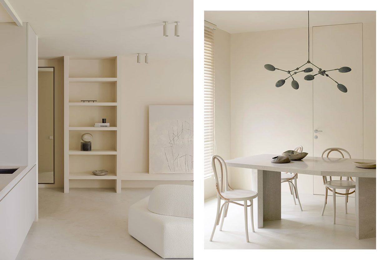
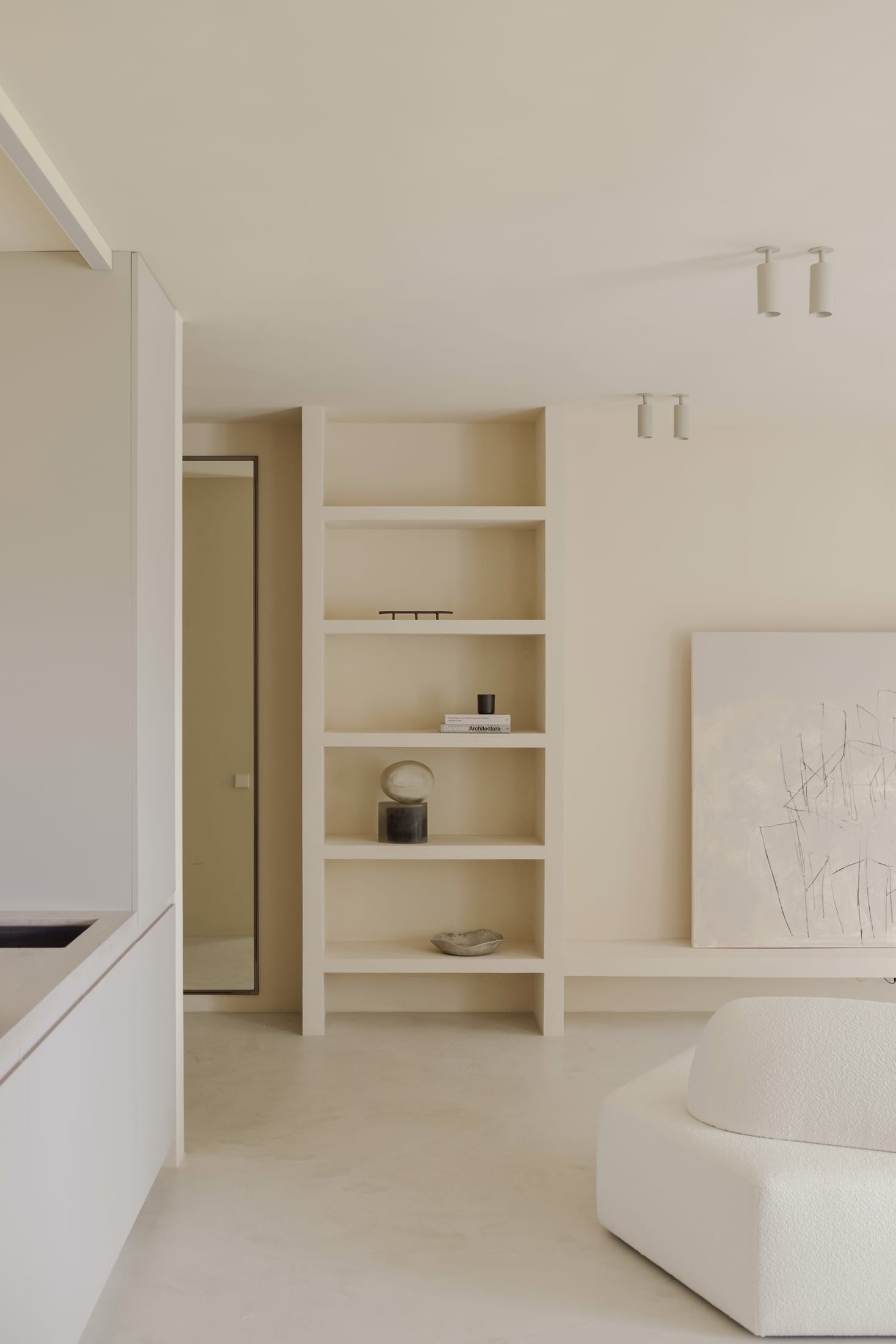
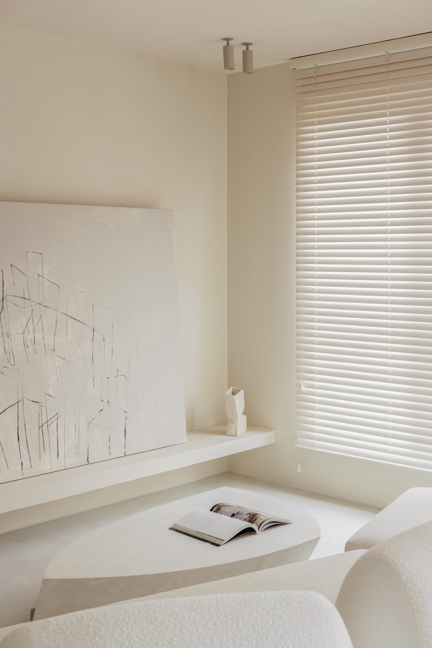
One of the most common mistakes I see in small apartment design is the over-reliance on high-gloss surfaces. While the logic seems sound—gloss reflects light—the reality is often a harsh, clinical glare that creates visual noise. In the Blondie Space, Kudin opts for a "Matte" minimalist palette. Matte surfaces diffuse light, spreading it softly and evenly across a room, which creates a much more serene and expansive feel.
I recommend implementing the 'No Black' Rule. In small spaces, high-contrast dark tones act like "light sinks," absorbing the very brightness you’re trying to cultivate. By sticking to a spectrum of matte whites, soft oatmeals, and light greys, you eliminate the deep shadows that make a room feel smaller.
To prevent this palette from feeling cold, you must layer in texture. Think:
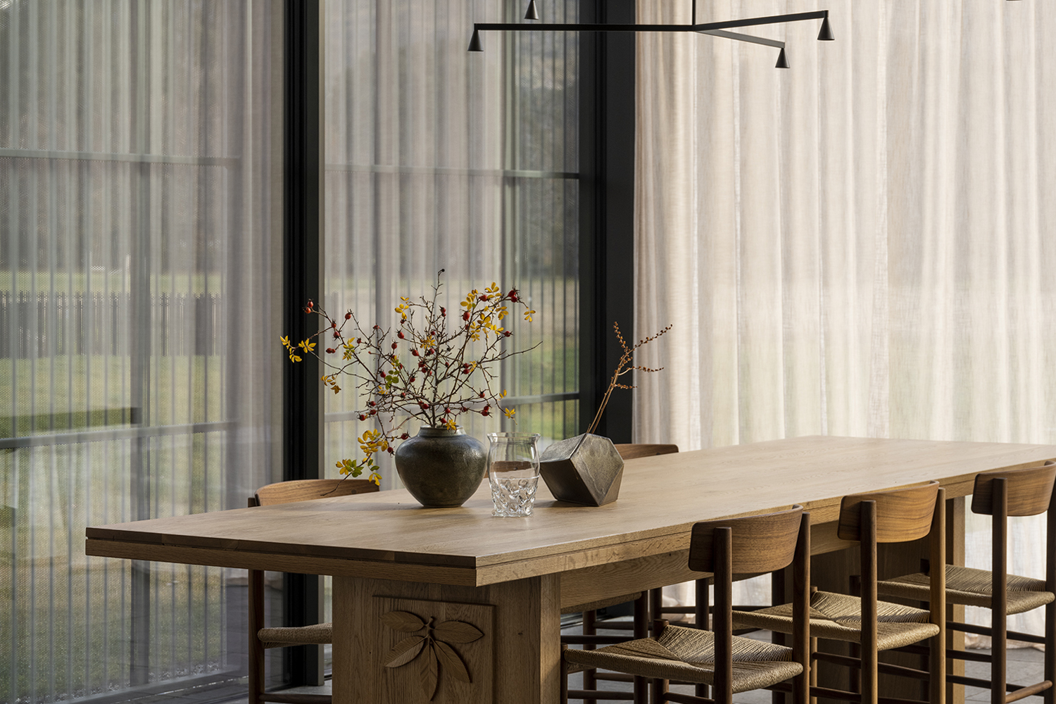
- Linen Drapery: Choose sheers that catch the sun without blocking the view.
- Venetian Plaster: Adds a subtle, pearlescent depth to walls.
- Natural Stone: Unpolished travertine or light limestone provides organic warmth.
2. Structural Expansion: The Balcony Integration
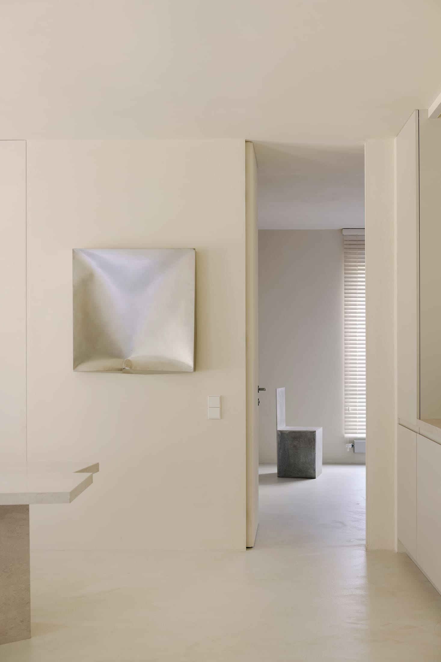
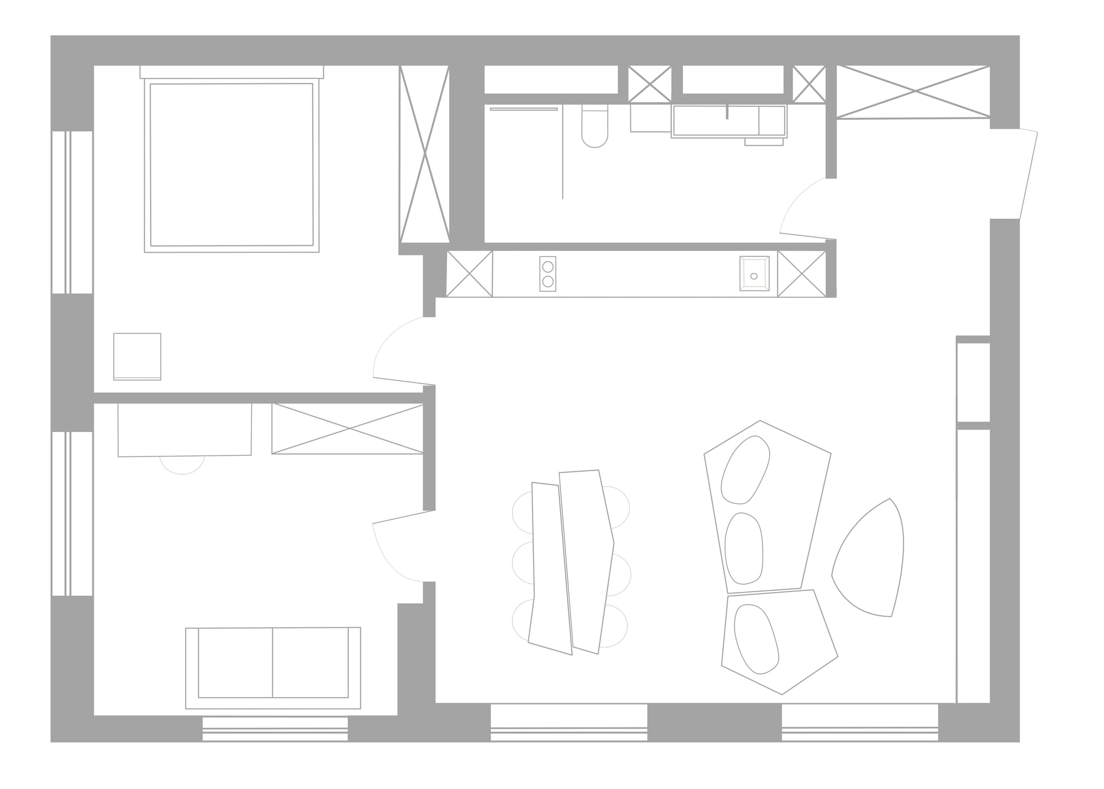
The traditional balcony is often a wasted space—a catch-all for bicycles and drying racks that creates a visual and physical barrier between you and the outdoors. In the Blondie Space, the balcony was integrated directly into the 70-square-meter floor plan.
Pro Tip: Integrating a balcony into a small floor plan can increase the effective natural light surface area by up to 25% while creating room for additional functional zones, such as a breakfast nook or a sun-drenched reading corner.
By removing the standard sliding door and replacing it with a seamless transition, you allow the eye to travel all the way to the building's exterior envelope. This floor-to-ceiling visual flow tricks the brain into perceiving the entire outdoor horizon as part of your living room.
3. Zoning Without Walls: The 2026 Layout Strategy
The moment you build a wall in a small apartment, you kill the light. The 2026 approach to compact living favors "Visual Zoning" over physical barriers. The goal is to define areas—sleeping, working, lounging—without blocking a single photon of sunlight.
Effective zoning is achieved through subtle shifts in texture and layered lighting. I suggest using:
- Low-Profile Rugs: A change in floor texture immediately signals a change in "room" without a vertical obstruction.
- Varied Floor Heights: A slight 10cm dais for a sleeping area can define the zone while keeping the ceiling plane continuous.
- The Path Test: Before finalizing your layout, map your common walking routes. If you have to zigzag around furniture, your "path" is cluttered, and so is your light flow. Ensure clear, straight lines of sight from one end of the apartment to the other.
4. Eliminate Visual Noise with Recessed Niches
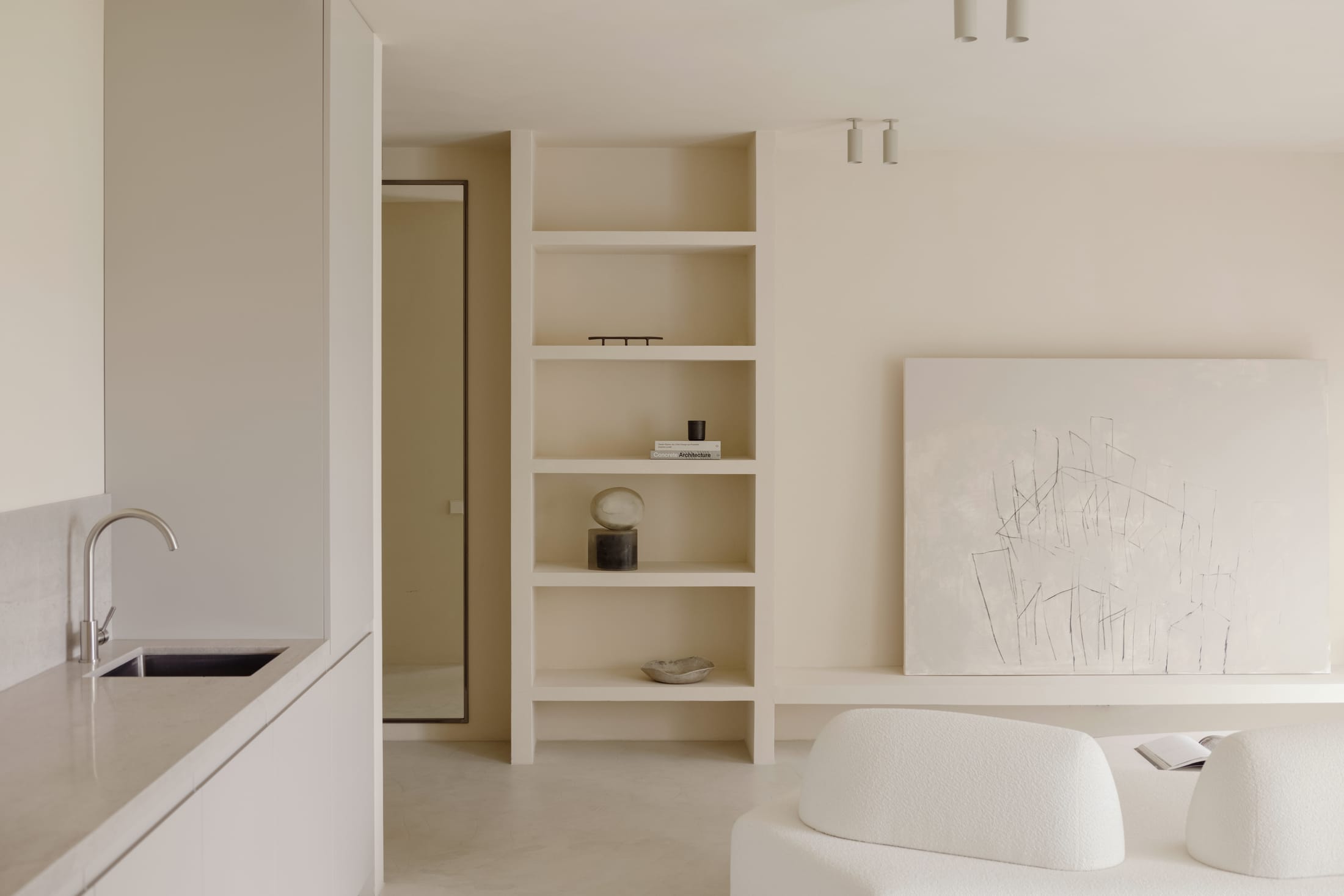
External storage units—wardrobes, bookshelves, chests of drawers—are the enemies of light. They cast shadows and "eat" floor space. The Blondie Space approach is to move storage into the architecture itself through recessed wall niches.
Pro Tip: Switching from traditional external storage units to recessed wall niches finished in the same material as the walls can reclaim approximately 8-12% of usable floor space while significantly reducing visual noise.
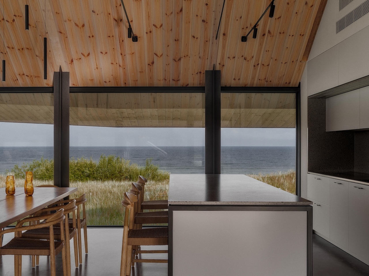
This philosophy extends into the kitchen. I always advise my readers to eliminate upper kitchen cabinets. While it might seem like a sacrifice in storage, the payoff is immense. Removing those heavy, overhanging boxes eliminates shadows on the workspace and makes the entire kitchen feel like an extension of the living wall rather than a cramped utility zone.
5. Custom, Asymmetrical Furniture for Visual Flow
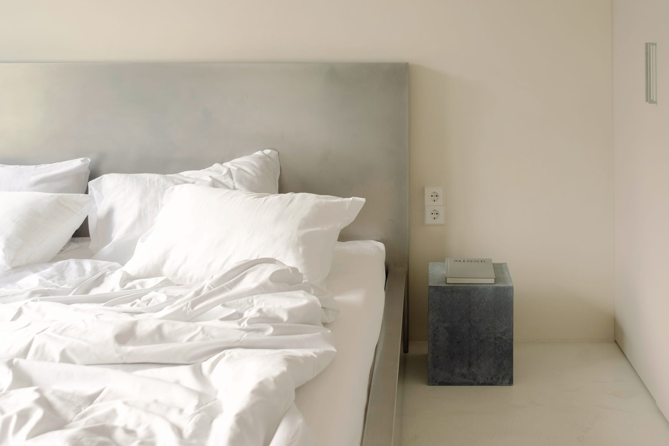
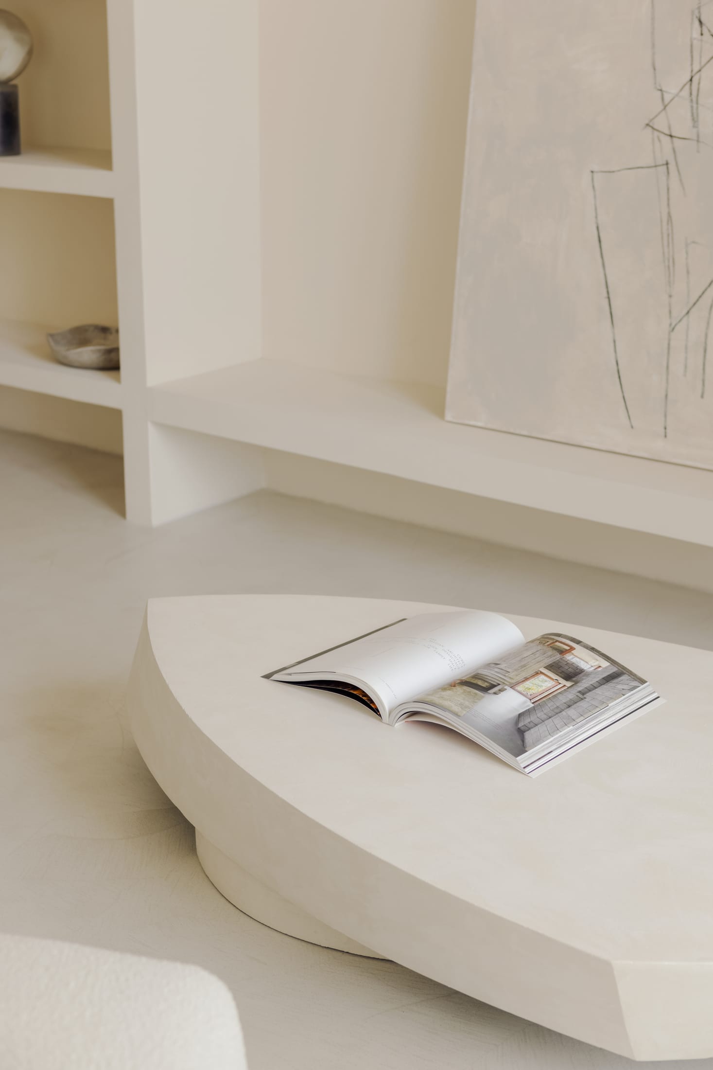
In a small home, every item must earn its keep. Kudin’s Blondie Space utilizes custom-designed furniture that emphasizes "leggedness" and asymmetry. When you can see the floor continuing underneath a bed or a sofa, the room feels larger.
I prefer one large, sculptural statement piece over multiple small, cluttered items. For example, a custom travertine washbasin or a slim metal bed frame acts as functional art. Asymmetrical silhouettes allow for a more organic flow of movement and light around the objects, preventing that "boxed-in" feeling common with standard furniture sets.
6. Mastering Layered and 'Hidden Glow' Lighting
As we move toward 2026, the single central ceiling light is officially a relic of the past. To maximize light, you must layer it: Ambient, Task, and Accent. But the real secret of the Blondie Space is the "hidden glow."
Using LED columns and hidden wall panels creates a soft, architectural wash of light that mimics the way natural light bounces off surfaces.
- Circadian Rhythms: For 2026, I am seeing a rise in AI-powered fixtures that adjust their color temperature throughout the day—bright, blue-toned light in the morning to wake you up, and warm, amber hues in the evening to prepare you for rest.
- Portable Lighting: For renters who can't hardwire new fixtures, high-end wireless lamps are a game-changer. They allow you to place light exactly where you need it without the visual clutter of cords.
7. The Power of Verticality and Strategic Mirrors
Finally, don't forget to look up. In small homes, the vertical plane is often neglected. Wall-mounted "cloffices" (closet offices) allow you to fold away your workspace, keeping the floor clear and the light unobstructed during non-work hours.
Mirrors remain a staple, but their placement must be strategic. Instead of just hanging a mirror anywhere, place a large, slim-framed mirror directly opposite a window. This effectively "doubles" the window, bouncing the view and the light back into the deepest parts of the room.
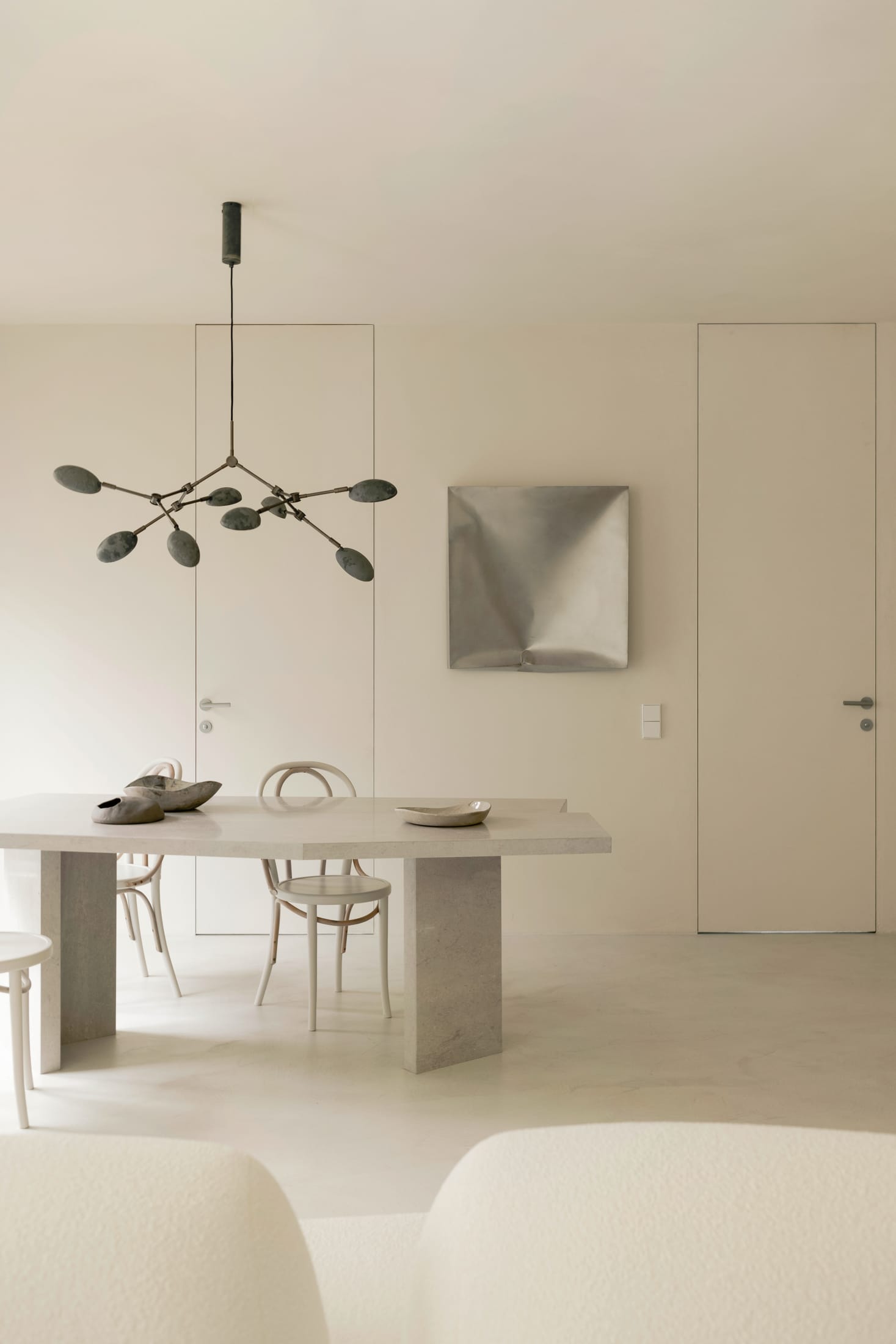
However, a crucial lesson from the Blondie Space is the importance of "Dead Zones." It’s tempting to fill every wall with art or shelves, but leaving some walls entirely empty provides essential "breathing room" for the eye and allows the light to travel without interruption.
Conclusion: Designing Slowly for Long-Term Clarity
The genius of the Blondie Space isn't found in a single expensive brand or a fleeting trend; it’s found in restraint, material consistency, and light-first planning. By integrating our outdoor spaces, choosing matte finishes over gloss, and moving our storage into the walls, we can transform even the most compact apartment into a bright, airy home.
Designing a small space requires patience. Don't rush to fill it with furniture. Instead, live in the space for a few weeks, watch how the sun moves across your walls, and then build your home around the light.
FAQ
How can I maximize light if I’m in a rental and can't remove walls? Focus on the "No Black" rule and lighting. Swap out dark rugs for light, textured ones, and use high-quality portable LED lamps to create layers of light. Strategic mirror placement opposite windows is also a non-permanent way to double your brightness instantly.
Are matte finishes harder to clean than glossy ones? Modern 2026 matte finishes and paints are designed with high durability and "scuff-resistance." While they may require a slightly different cleaning approach, the aesthetic benefits—specifically the soft diffusion of light—far outweigh the minor maintenance difference.
Isn't removing upper kitchen cabinets a waste of storage? It requires a shift in mindset. It forces you to declutter and keep only the essentials. By moving rarely used items to lower cabinets or a recessed wall niche, you reclaim the visual "air" at eye level, which is what truly makes a small home feel spacious.